When my clients built a two-story house on a corner lot, they also wanted a garden of their dreams and a landscape to set the house to its best advantage. The rooms in the Prairie-style house have a wonderful sense of space and proportion, and we sought to extend that same sense of gracious space into the yard in a way that would be appealing and natural. However, the lot is only 90 feet wide by 125 feet deep, and the house and driveway cover about half of the site.
I always look to see what parts of a landscape view I can borrow to incorporate into the viewing corridor—and never more so than in urban areas, where lot space usually is limited. In this case, there were no neighboring views to steal. I used six strategies to expand the sense of space in relation to the house. I regularly use these techniques on any small parcel—whether in cities or suburbs—to make the most of the landscape and enhance the way a house sits on the lot.
Front yard design strategies

Emphasize the ground plane
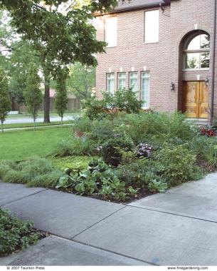
To make the house size and lot size appear more equal in scale, I emphasized ground plane, with a goal of making it as compelling to look at as the house. divided the front yard into four equal areas: A turf, B perennials, C ground covers, D driveway (see illustration, below). The perennial garden in the center of the yard focuses the eye downward and helps make the house sit better on the lot. The sweep of ground cover offsets the proportions of the driveway. I chose pachysandra (Pachysandra terminalis, USDA Hardiness Zones 4–8) because it is sturdy, reliable, and evergreen, which meant it could do its part in holding up the landscape design throughout the year. The proportions of the perennial garden and the turf balance each other.
Use strong vertical lines to enhance scale
Squiggly bed lines (a rarely recommended landscape design tool) would make the landscaping look frivolous and inconsequential in comparison to its site. Mature parkway trees already gave the house an overhead canopy. I created strong vertical lines on the ground plane by planting eight narrowly columnar European hornbeam trees (Carpinus betulus ‘Fastigiata’, Zones 4–8) in a row of five on the north side of the lot and three on the south side. These emphatic vertical lines help visually anchor the tall house to the ground.
Extend the garden and lawn to the curb
With no neighboring views to steal, I extended the garden and lawn into the 12-foot-wide parkway between the sidewalk and the street, providing more continuity between the landscaping and the street. When your view of a lot includes street, parkway grass, sidewalk, and lawn, your eye treats the property as a whole. On the house’s north side, I matched my ground-plane planting (in this case, lawn) to the parkway. We have sweeping ground-cover beds on the south side, so I planted the nearby parkway with ground cover. I also installed a naturally rusting corten-steel retention wall between the turf and perennial bed, and extended the wall to the sidewalk at one end and the street at the other. These strategies enhance the sense of view, making the site seem bigger than it is and balancing the proportions of the house.


Backyard design strategies


Orient bed lines at an angle to the house
I often find that a patio set square to a house on a small lot only enhances the bulkiness of the house in relation to its landscaping. To create a sense of movement and encourage travel through the garden, we positioned the smaller areas of the garden (patios, pond, and lawn) on 45-degree angles to the house. This helped offset the mass of the house and better capture the longest possible views of the garden.
Locate seating areas away from the house
Did you ever attend a summer party and find the guests clumped together on the patio, unwilling to enter the garden? In some places on this property, only 35 feet separate the house and the rear lot line, and I wanted the entire yard to feel accessible. To encourage guests to enter the yard, I moved the patio away from the house to place the seating areas more deeply into the garden. This strategy makes it seem like there’s more space because it requires guests to take a short journey, walking down a few steps and past beautiful plants.
Divide the yard to add depth
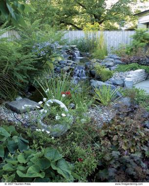
Long, narrow spaces often seem larger when divided into smaller areas or “subdivisions.” That’s because a variety of areas in the garden can pull your gaze in, enhancing the sense of depth. A broad expanse of lawn next to the patio, with perimeter plantings around the fence, would make the space feel small. It would also be boring. We created multiple areas of interest, including a three-level pond, with a retaining wall that is slightly higher than the middle level and that provides seating to better enjoy the pond. We separated the patio into two areas: a large space for a table and chairs and a smaller patio for reading. To delineate the lawn area, which we call the croquet lawn, we rimmed the perimeter with an 8-inch-high lannonstone wall and slightly bermed the plantings around it. When your eye travels from plants to patio to lawn to more plants, the perceived distance is greater and the garden seems bigger.


Comments
Log in or create an account to post a comment.
Sign up Log in