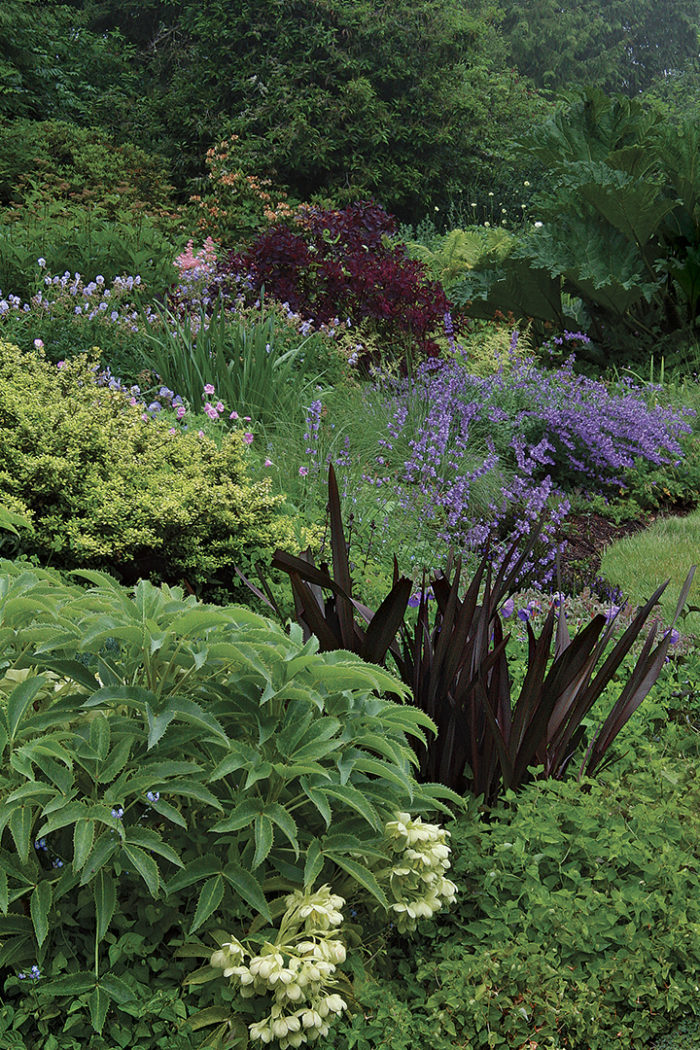
Imagine driving through miles of farmland or desert, where hour after boring hour the landscape never changes. If you’re like most of us, you’d tune out pretty quickly. That’s because our minds crave change. Too many gardens, however, are like one long car ride: There’s not enough variety, not enough to see, and nothing to make us pause and take a closer look. The gardens that we find most enticing are usually those that hit a balance between offering enough contrast to hold our attention but not so much that the scene appears harsh or overly busy.
Subtle changes are often just enough to make us take notice. Pairing different colors or different shades is perhaps the most obvious way to create contrast, but the shapes of plants and their varying textures also play a huge part in making a garden interesting.
The good news is that you don’t have to be artistic to have a knack for creating great plant combos. By simply knowing a few ground rules, you’ll be well on your way to designing a garden that offers a feast for the eyes.
Build a Leafy Framework to Show Off Bright Colors
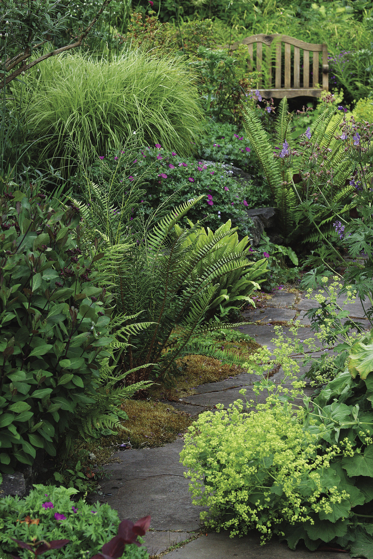
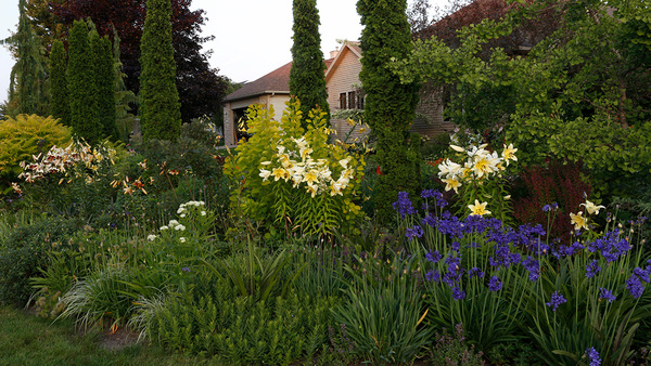
Compared to flowers, foliage has far more staying power. If you select the bulk of your plants for their interesting leaves, as opposed to their beautiful blooms, your garden will look better longer. But a foliage-heavy composition has another benefit, too. Using abundant foliage gives beds a lush, full look and prevents color overload. Hot and cool hues are at their best when used within a leafy green framework. Areas of visually quiet foliage give your eye a break so that when you look at an area with bright color you’re more receptive.
When building a framework, consider the density of the plants you select. Evergreens have a solidity that reads as visual weight. Deciduous trees and shrubs have a light appearance and, therefore, carry less visual weight. To achieve a balance between the two, use more deciduous plants than evergreens.
Also, remember that movement heightens the contrast between airy and dense plants. Solid shrubs, such as boxwood (Buxus spp. and cvs., USDA Hardiness Zones 6–9), play off lighter, more delicately textured plants, like grasses, which dip and sway in the breeze while their heavier neighbors remain still. I like to use dense shapes to flank entryways or to mark the end of a garden bed. Because solidity reads as weight, however, place these plants carefully to prevent an unbalanced composition. To offset a long, solid hedge on the left side of a garden, for instance, plant a grouping of equally dense but differently shaped trees to the right. The idea is to have structure for winter (commonly called the “bones” of the garden). Then, contrast these bones with lighter, ephemeral spring and summer plantings.
Soften Contrast by Grouping Plants with similarities
When arranging plants in a garden, pay as close attention to their commonalities as you do to their differences. A well-designed plant combination takes advantage of both. Select a few specific plants and colors—or, better yet, two pairs of contrasting shapes, colors, or textures—and repeat them throughout your garden. Frequently using purple as a contrast to yellow, for instance, and sword-shaped leaves as a contrast to round-shaped leaves will establish a subtle pattern within your landscape. The contrasting traits help ensure eye-catching plant combos, while the repetition keeps the overall scene from looking chaotic.
As you build compositions, be sure to vary the height and shape of neighboring plants, as well. A good vignette offers something to admire at every level, from the lowest ground cover to the highest backdrop. And don’t just put the shortest plants in front and the tallest in back; stagger them, as well. This approach not only lets you see all your plants at once but also encourages their different shapes, textures, and colors to mingle in a pleasing way. Regardless of whether you’re pairing dense with airy, big with small, or hot with cool, the motivation is always the same: Contrast is all about showing off your plants’ best features—because when they look good, so does your overall garden.
Successful Vignettes are All About Balance
The prettiest compositions have contrast—but not too much. This grouping hits just the right note, with each plant playing an important role. The vignette is harmonious, thanks to the repetition of purple beside yellow and spiky foliage beside rounded leaves, and yet not one plant looks exactly like its neighbors.
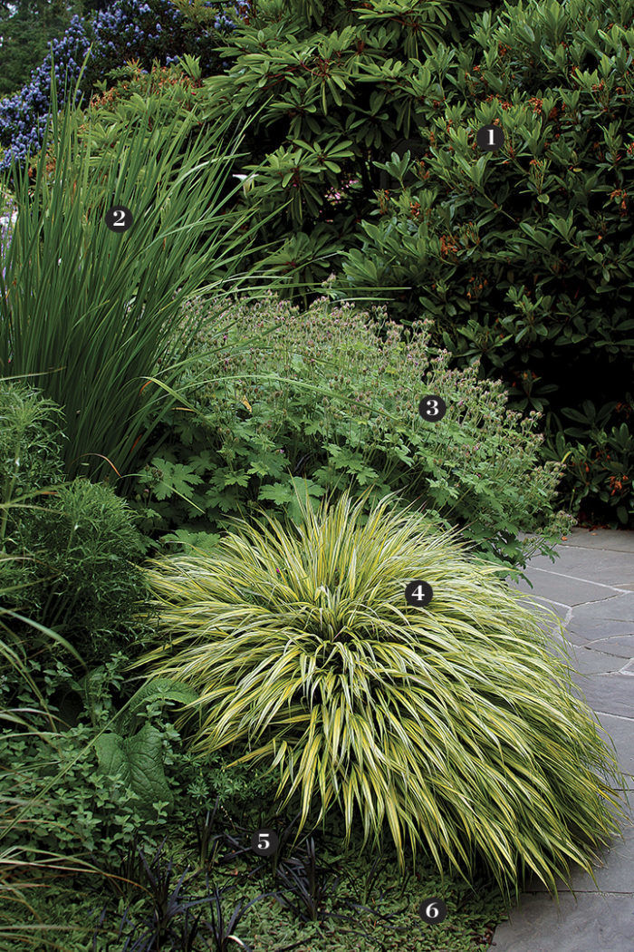
1. Rhododendron (Rhododendron spp. and cvs., Zones 5–9)
Contrast: Its rounded leaves contrast with the airy, grasslike foliage in the foreground.
Similarity: The geranium and forest grass boast a similar mounding habit.
2. ‘Tycoon’ Siberian iris (Iris sibirica ‘Tycoon’, Zones 3–8)
Contrast: Its spiky foliage contrasts with the rounded leaves of the rhododendron and geranium, while its purple flowers pop beside the yellow Japanese forest grass.
Similarity: Black mondo grass repeats the foliage shape and flower color.
3. Hardy geranium (Geranium magnificum, Zones 4–8)
Contrast: Cut leaves make it stand out from its neighbors.
Similarity: Its size and shape resemble that of the Japanese forest grass, and in early summer, it sports purple blooms, like the iris.
4. ‘Aureola’ Japanese forest grass (Hakonechloa macra ‘Aureola’, Zones 5–9)
Contrast: Its golden-colored leaves look even brighter next to the black mondo grass and the purple-flowering geranium and iris.
Similarity: The iris and black mondo grass share the same spiky texture.
5. Black mondo grass (Ophiopogon planiscapus ‘Nigrescens’, Zones 6–11)
Contrast: Its dark coloring pops beside the much brighter forest grass.
Similarity: The leaves echo the purple accents at its feet and repeat the grassy foliage behind it.
6. ‘Platt’s Black’ brass buttons (Leptinella squalida ‘Platt’s Black’, Zones 4–7)
Contrast: The jagged texture of its fernlike foliage contrasts with the smooth grassy blades above it.
Similarity: Dark purple tones on its leaves pick up the color of the black mondo grass.
Sharon Nyenhuis is a garden designer in Sequim, Washington.
Photos: Ann E. Stratton
Fine Gardening Recommended Products
A.M. Leonard Deluxe Soil Knife & Leather Sheath Combo
Fine Gardening receives a commission for items purchased through links on this site, including Amazon Associates and other affiliate advertising programs.







Comments
Log in or create an account to post a comment.
Sign up Log in