Lucky for me, I have a vivid imagination. The original landscape surrounding my 1950s-era suburban ranch house was about as interesting as milk toast after a 24-hour soak on the kitchen table. The 4-foot-tall junipers planted under the front windows had been heavily box-pruned. After I removed 25 years of dead growth from the lower half, they looked more like tables than boxes. In addition, there was plenty of patchy lawn to run the mower over. The back garden sported more lumpy lawn, a weeping cherry half eaten with gall rot, and an ancient rose garden “walled” by arborvitae. In my view, this landscape was a perfect blank slate.
I rolled up my designer’s sleeves, anticipating fun. With a scaled base map in hand, I set to work at the drafting table. I briefly considered the issue of resale value, but then I decided: Why allow the neighborhood to dictate “the norm”? I believe that if you have something to say, say it with conviction. Of course, my neighbors may have thought I was talking with my mouth full of pebbles because it took three years to build my garden. As you can see from the photos, I definitely had something to say.
Frame a view
I don’t know whether I love architecture more than plants or whether I love architecture because it allows me to present the plants beautifully. I think it’s the latter.
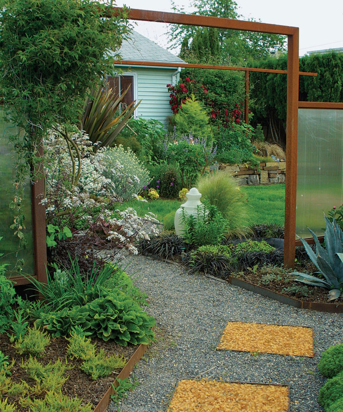
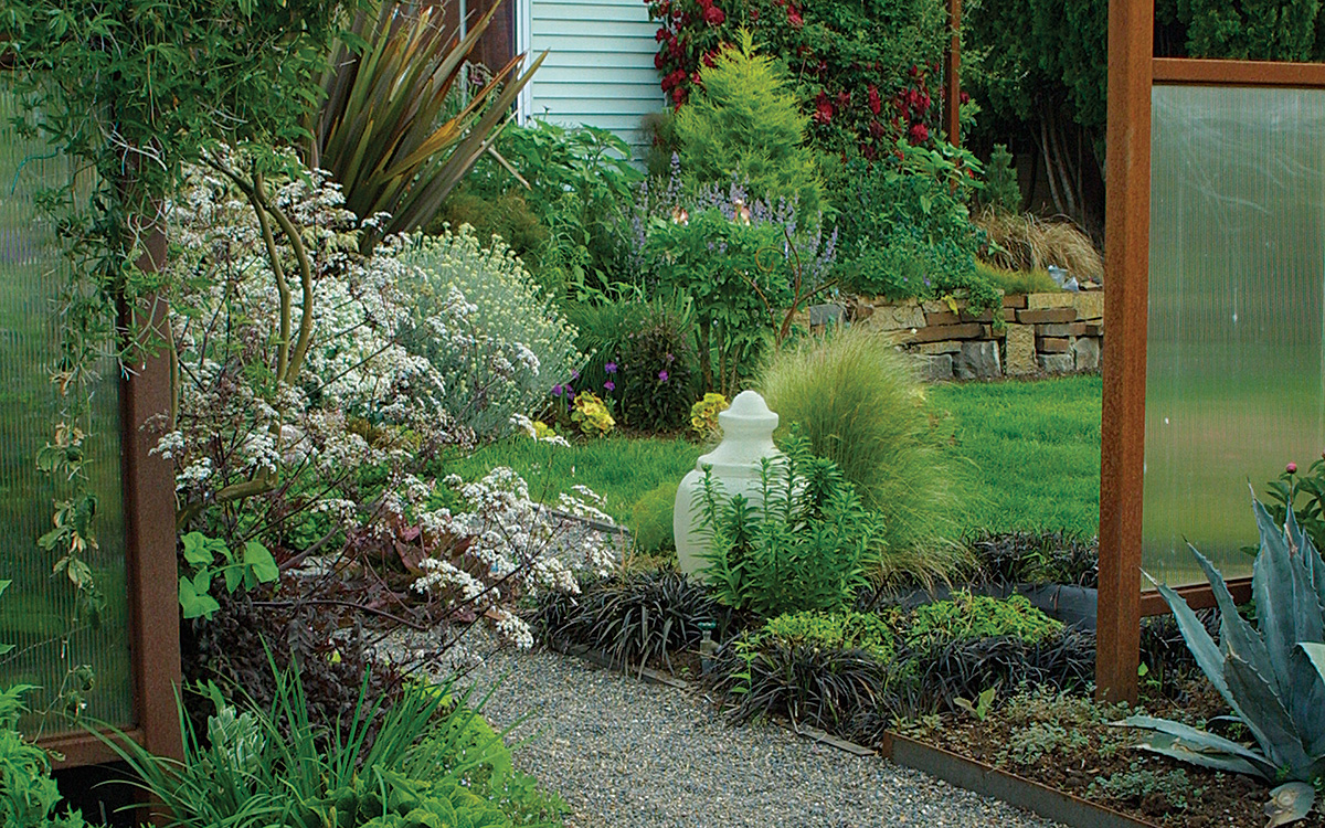
At the main entrance to my front garden, an opening in a fabricated steel fence, inspired by rusted metal roofing I saw while in Hawaii, focuses attention on the scene it frames. The fence has panels of polycarbonate, pivoting wooden boards, and steel mesh, which permit passersby to glimpse my garden.
To further draw in visitors, I repeat the colors of plants and hardscape materials. The fence’s rich rust color is echoed by the amber sea glass in the path and the earth-tone retaining wall. Milky hues are present in the iridescent fence panel (far right in the photo), the globe (center), and the house siding (top).
The golden color of the maturing heather (Calluna vulgaris ‘Wickwar Flame’, USDA Hardiness Zones 5–7) in the foreground reappears in the Mexican feather grass (Stipa tenuissima, syn. Nasella tenuissima, Zones 7–11) at the midpoint and in the Monterey cypress (Cupressus macrocarpa, Zones 7–11) toward the back.
Consider multiple perspectives
Two great aspects of gardens are that they’re always changing and they’re a three-dimensional medium. Flowers come and go throughout the season, while foliage and plant structures mature and come into their own. Plants also have the potential to be viewed from multiple perspectives.
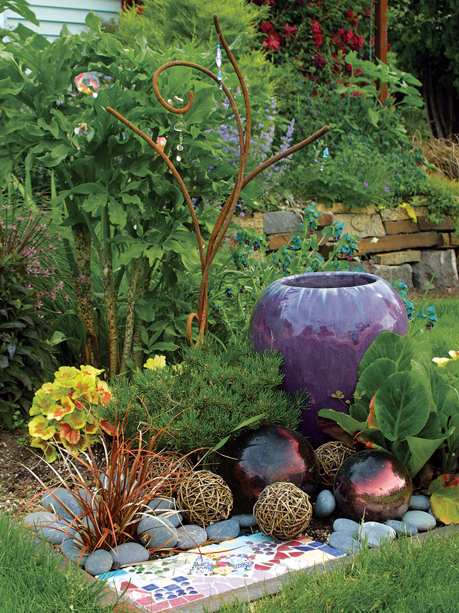
This small, textural composition, for example, offers two distinct experiences, depending on your vantage point. Both begin with a piece of purple glazed pottery to give the scene weight. Carefully placed grapevine spheres and glass gazing balls (photo right) mimic the rounded form of the pottery, while a warm-toned hook sedge (Uncinia uncinata, Zones 8–11) repeats the color and form of a rusted-steel sculpture. The mix of colors and shapes gives the scene a flamboyant appearance.
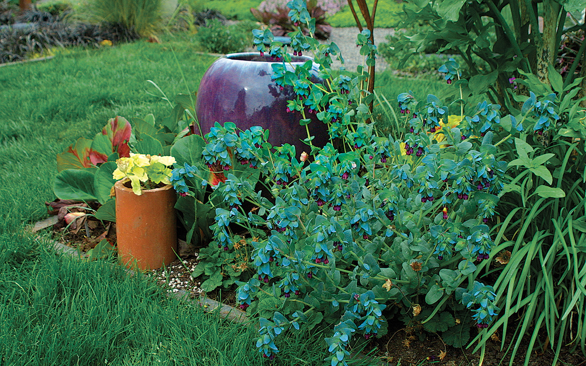
When viewed from the opposite side (photo above), the purple pottery becomes a foil that sets off the foliage and flowers of nearby plants. The large, green leaves of bergenia (Bergenia spp. and cvs., Zones 3–9) and the bright yellow foliage of geranium (Pelargonium cv., annual) provide contrast. Meanwhile, the glaucous, gray-blue leaves and purple blooms of Cerinthe major ‘Purpurascens’ (annual) harmonize perfectly with the purple pot, providing a moment of serenity.
Layer plants to create visual rhythm
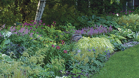
Most of my plant choices were guided by my hardscape installations, what I wanted my space to “say,” and my chosen color palette. Other selections were the result of my experimental nature and my love of texture. The extensive use of leaf shapes allows me to enjoy my garden longer than if it were dependent upon flower color.
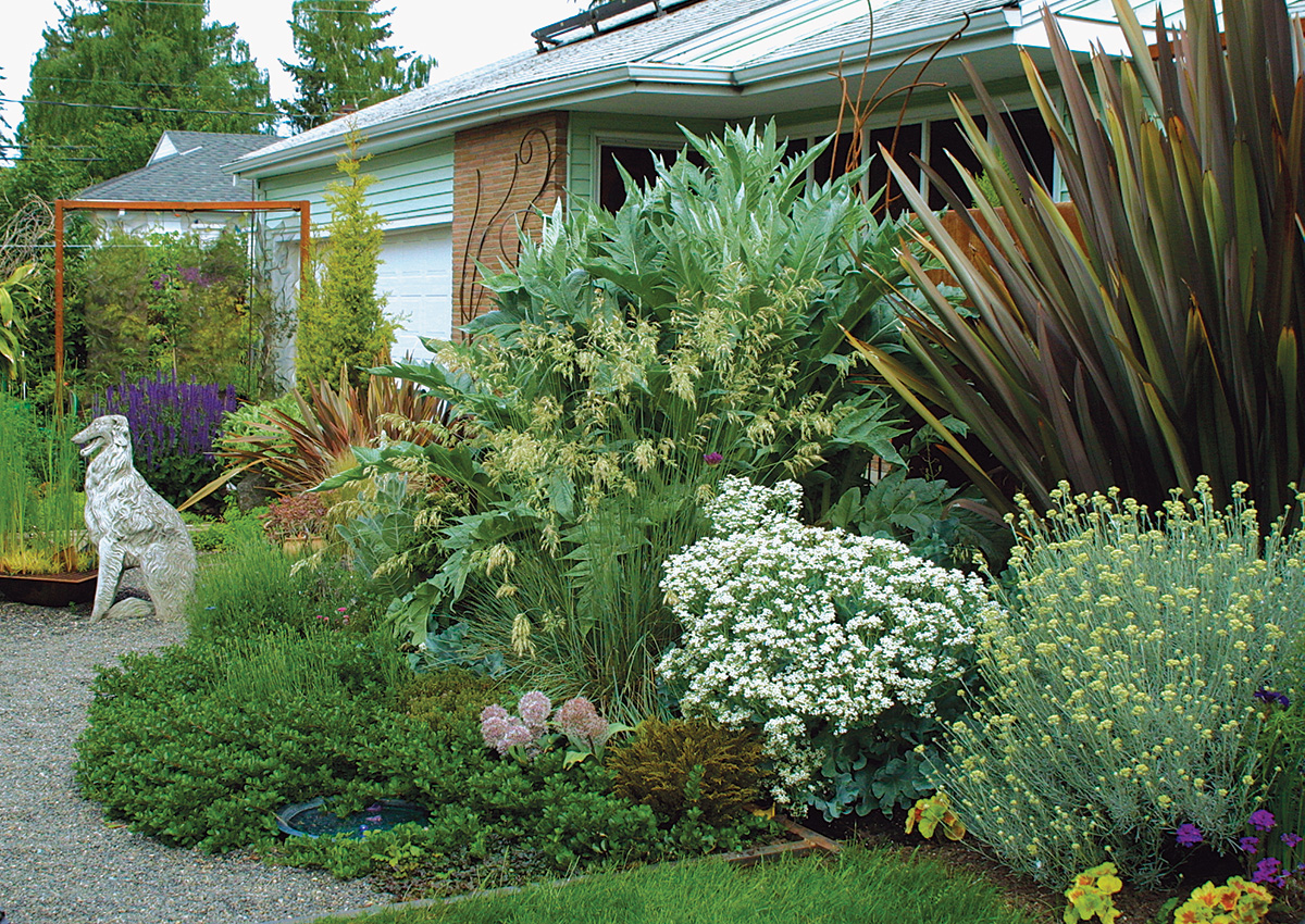
I focused on layering plants with interesting foliage shape and color—and personality—to create a visual rhythm. The southern exposure allowed me to take advantage of blue- and silver-foliage plants like cardoon (Cynara cardunculus, Zones 7–10), blue oat grass (Helictotrichon sempervirens ‘Sapphire’, Zones 4–9), sea kale (Crambe maritima, Zones 6–9), and curry plant (Helichrysum serotinum, Zones 7–10). For added depth, I inserted dark foliage plants like New Zealand flax (Phormium tenax ‘Bronze’, Zones 9–11) and bronze hebe (Hebe ochracea ‘James Stirling’, Zones 8–10). A rust-colored concrete wall backs this planting and ties it to nearby fencing.
Indulge in dramatic focal points
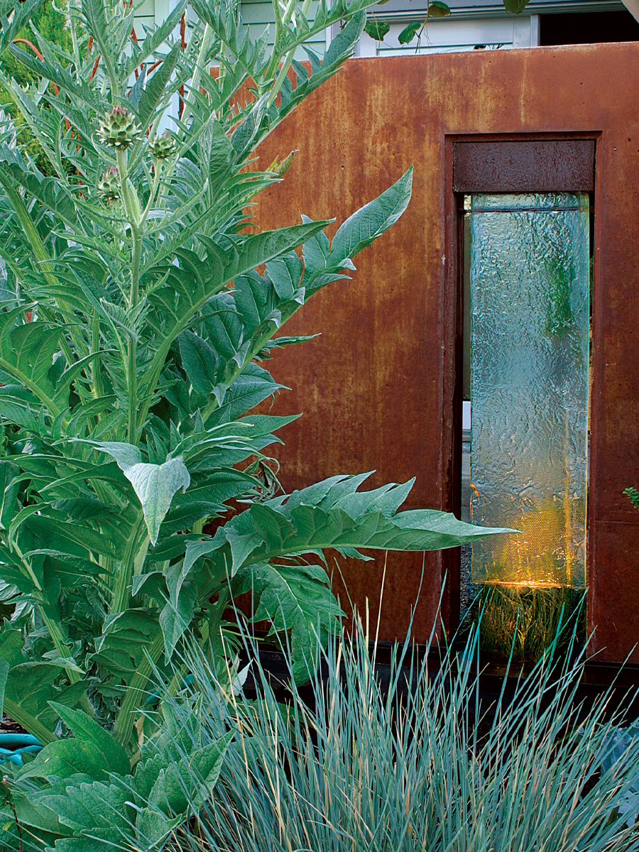
The inspiration for the wall came one day while I was swimming laps at the pool. Looking up from the water, I saw sun reflecting off the rippling water surface and onto the building’s walls. I wanted the same effect in my garden. In spring and summer, my water feature is nearly masked from the front view by cardoon and blue oat grass, but I can enjoy it from the other side, which faces my bedroom’s French doors. I see this part of my garden first thing in the morning, and it provides a romantic glow as I drift off to sleep each night. The focal point of my front garden is a wall made of poured concrete and glass from a recycled light fixture, with water flowing down the glass. I’ve placed the wall so it can be seen from the street; it is intended to be art in the winter and a backdrop for plantings in the summer. My front garden is built upon different perspectives of this piece. I love it. It cost a bundle, but it was worth every penny.
Experiment with color
Once I’ve chosen the base color, I add flower colors; I am constantly experimenting with them. In my courtyard, I put another favorite color—violet—into play, by using plants like purple sage (Salvia × sylvestris ‘May Night’, Zones 5–9). The saturated color energizes the courtyard, especially when chartreuse plants like Euphorbia stricta ‘Golden Foam’ (Zones 10–11) appear to glow when the light hits them just right. For color, I use objects like furnishings, sculptures, and ceramic pots instead of relying solely upon flowers. The siena fence that weaves through my plantings provides color as well as a structural foundation. In the courtyard near the front entrance to my house, I have placed chairs and a coffee-table footrest—an old cold-air return planted with cattails (Typha spp., Zones 2–11) and dwarf golden sweet flag (Acorus gramineus ‘Minimus Aureus’, Zones 6–10). The rusty hues of these items serve as the base color. Chartreuse is the dominating color to accompany the rust tones; this is my interpretation of colors encountered in nature. The combination reminds me of moss growing on the north face of a tree or of lichens claiming the surface of a rusty piece of corrugated siding.
Use elevation changes to invite pauses
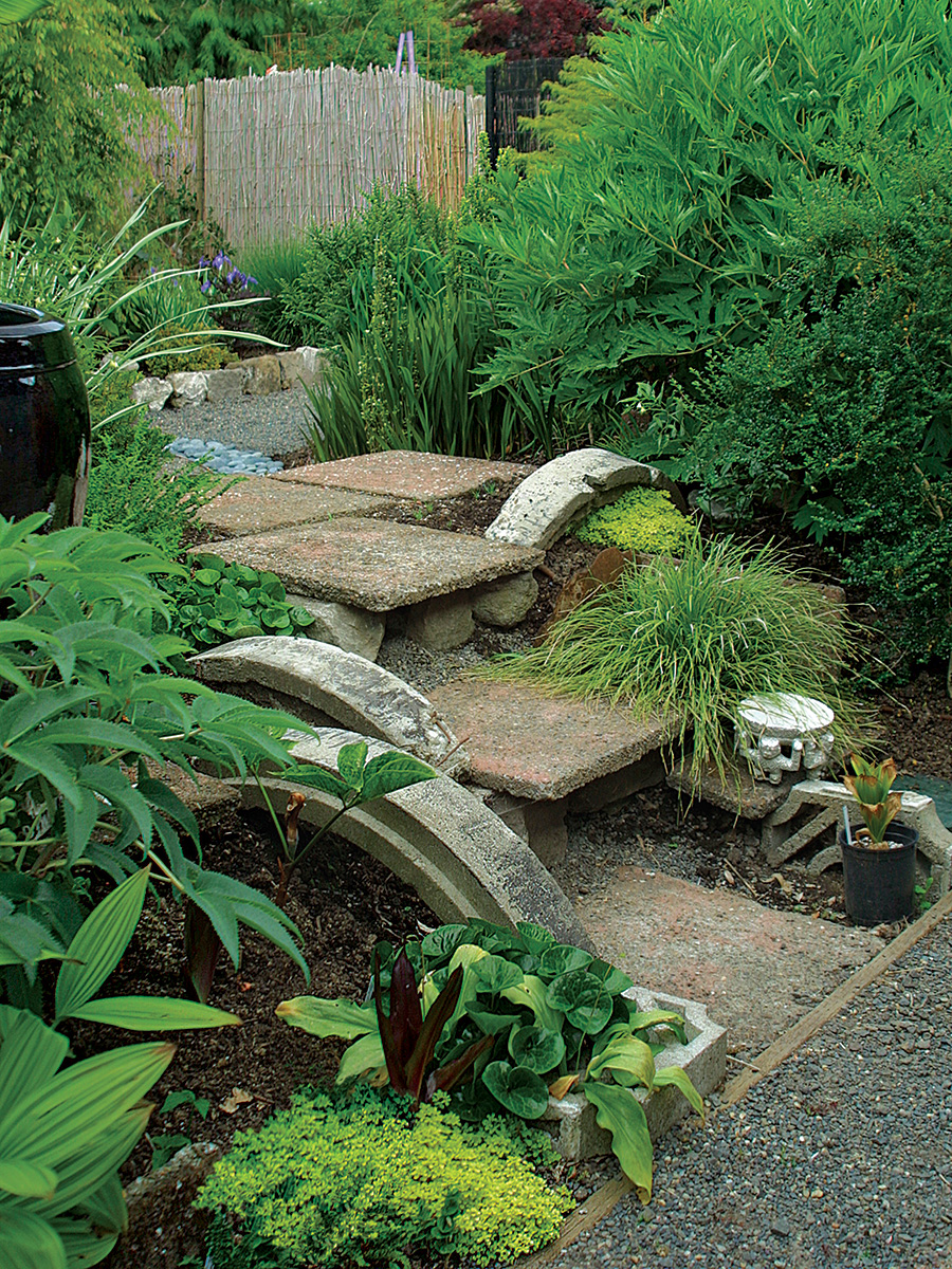
The top step enlarges to provide a place to pause, which encourages visitors to look down upon the garden. This is my way of asking them to slow down and be aware of the beauty of their surroundings. I love to change elevations within a garden. Sunken terraces become areas of quiet refuge, and they place visitors on a more personal level with the lush plantings around them. For my back garden, I constructed an elevated entrance that leads to my own private oasis. The entry path, built of recycled drain culverts and aggregate pavers, uses only three steps, but they must be taken at a thoughtful pace.
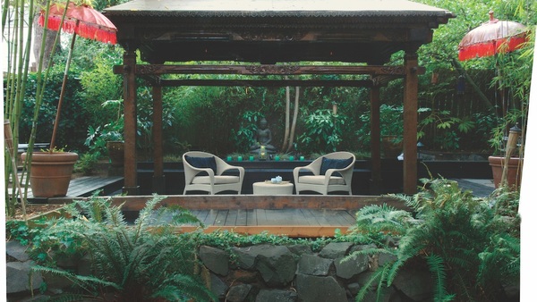
The entry leads to my interpretation of the Japanese enclosed garden (tsuboniwa), which provides a place for a family to enjoy sips of nature and renew their spirits. My front garden reflects my outgoing characteristics; my rear garden provides sustenance for my private, introverted self.
Although the colors, materials, and ambience are different in my back garden, there is a continuous design thread: I use simple graphic shapes. In such a detailed space, these lines and shapes are important because they provide structure and organization for an area that would otherwise appear chaotic.
A designer’s perspective: Let your imagination run wild
 |
 |
As a garden designer, I look to natural and manmade surroundings for inspiration. By observing nature, I reinterpret the inherent beauty of basic materials and incorporate that into my designs. Whether hiking in the mountains or pounding the pavement in the city, I’m constantly noting interesting, successful plant compositions and intriguing patterns and relationships among materials like steel, glass, and concrete.
I do not strictly adhere to one design philosophy, but I feel a kinship toward the design sensibilities of the Japanese and their observation of nature, and their incorporation of nature into their private dwellings. I also respect the level of detail found in the Japanese garden installations I’ve studied. Structures are crafted by hand using quality materials, elements are simplified to a pure form, and even the mundane (a cover for a drain, for example) is given artistic detail.
My signature style is the use of unique architectural elements, textural compositions, and artistic details. Building upon multiple perspectives and layered compositions, I create living sculptures you can actually enter.
Fine Gardening Recommended Products
Buffalo-Style Gardens: Create a Quirky, One-of-a-Kind Private Garden with Eye-Catching Designs
Fine Gardening receives a commission for items purchased through links on this site, including Amazon Associates and other affiliate advertising programs.
Gardener's Log Book from NYBG
Fine Gardening receives a commission for items purchased through links on this site, including Amazon Associates and other affiliate advertising programs.

SHOWA Atlas 370B Nitrile Palm Coating Gloves, Black, Medium (Pack of 12 Pairs)
Fine Gardening receives a commission for items purchased through links on this site, including Amazon Associates and other affiliate advertising programs.









Comments
Absolutely beautiful! Interpretation and composition are both studies in excellence. Well done!
Log in or create an account to post a comment.
Sign up Log in