All Ted and Nancy Dobson wanted was a simple container garden. But when my partner and I first met with them, we discovered that the Dobsons’ backyard looked more like the bottom of a swimming pool than a patio. It was a little space, with house and garage walls on one side, a shoulder-high retaining wall on the other, and a river of concrete in between. The tight dimensions made the yard feel closed in, and we couldn’t remove the paving due to drainage issues. The Dobsons hoped, however, that adding several pretty planters would, at least, soften the look.
Although it would have been simple enough to install a container garden, we knew that none of us would be ecstatic about the results. This property presented some imposing challenges, which were beyond the help of planters. We solved almost every problem at once, however, by building an elevated garden above the pavement and applying a few design techniques that would improve almost any small space.
Keep it simple
You don’t need loud colors and lots of ornaments to attract attention. This Zen-like garden relies on several key focal points to control pacing and make the space visually interesting.
1. Vietnamese planters
2. Water feature
3. Dining set
4. Ceramic container with pine
5. Torii gate
Design using foliage and bold details
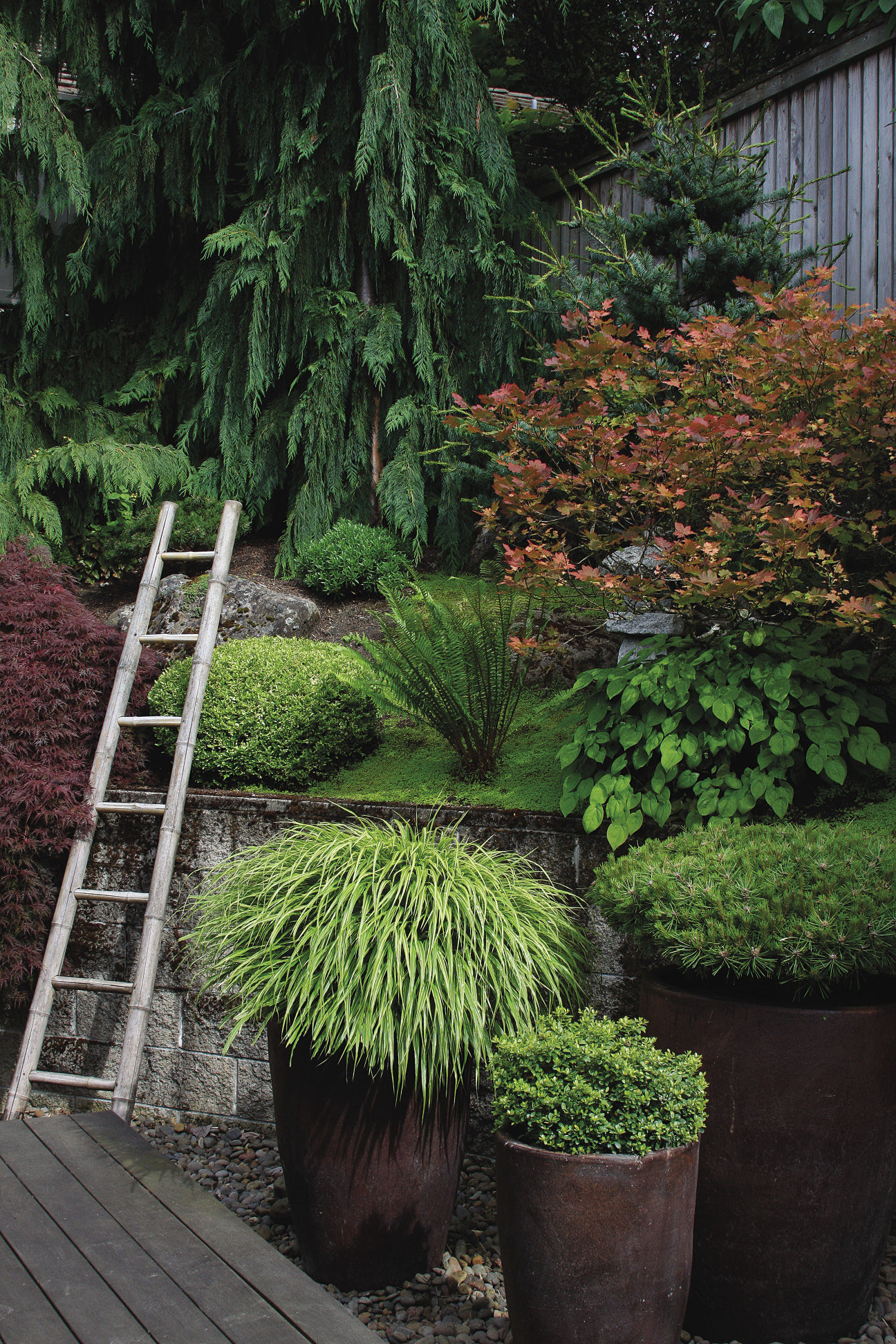
Ted and Nancy chose a visually quiet palette of greens, silvers, and burgundies, and they selected foliage-centric plants, which give the garden structure year-round. As this garden would be their only outdoor living space, it was vital to select plants that look as striking in June as they do in October. The plantings change subtly throughout the year but include almost no seasonal color from flowers, which would have left noticeable holes when they were out of bloom.
The focus on lush foliage reflects the Dobsons’ desire for a tranquil space. Pops of bright, saturated color, which a large garden could easily absorb, would have overwhelmed this little backyard. Like much of the garden, the plantings are inspired by the work of Japanese garden designers who, through the centuries, have understood that a mostly neutral color palette with contrasting textures and forms can make a small garden engaging and soothing.
People too often clutter small gardens with small objects. For this space, however, we strategically placed large containers to create a bold, clean look. Three tall, conical, Vietnamese planters (#1, site plan) between the deck and retaining wall provide a quiet focal point, visible from multiple angles in the garden. The containers’ size and location give them a strong presence, while their simple, unadorned shapes and solid colors allow them to coordinate effortlessly with other elements. The Dobsons further improved the space by replacing a grouping of small pots near the deck with a stately water feature (#2). Bringing such a large focal point into a tight space concerned them, at first, but the feature fell into place perfectly. It is broad enough to stand alone and tall enough to complement the 6-foot-tall bamboo screen directly behind it. When accessorizing a small space, pick containers, water features, and other ornaments that are too substantial to ignore and yet not so big that they feel shoehorned into place.
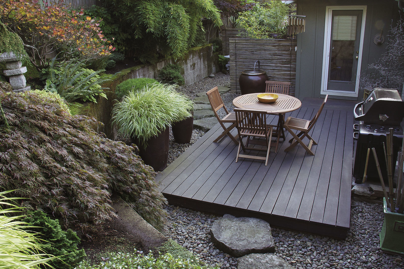
Limited space doesn’t mean you must settle for a cramped seating area. When it comes to spaces for entertaining, function is foremost. After all, if it doesn’t work well, you won’t use it. The Dobsons’ ample hardscape is both serene and practical. While many small spaces have only a tiny café table with a pair of chairs, this ipe deck comfortably seats four (#3). The opposite problem of oversizing, of course, was a risk, which is why we left so much breathing room around the ipe deck. At an absolute minimum, leave space for people to easily walk by empty furniture, and make sure that guests can scoot their chairs out without falling over an edge. Just a couple of feet is often enough buffer to make a seating area inviting.
Enclose the space to block visual distractions
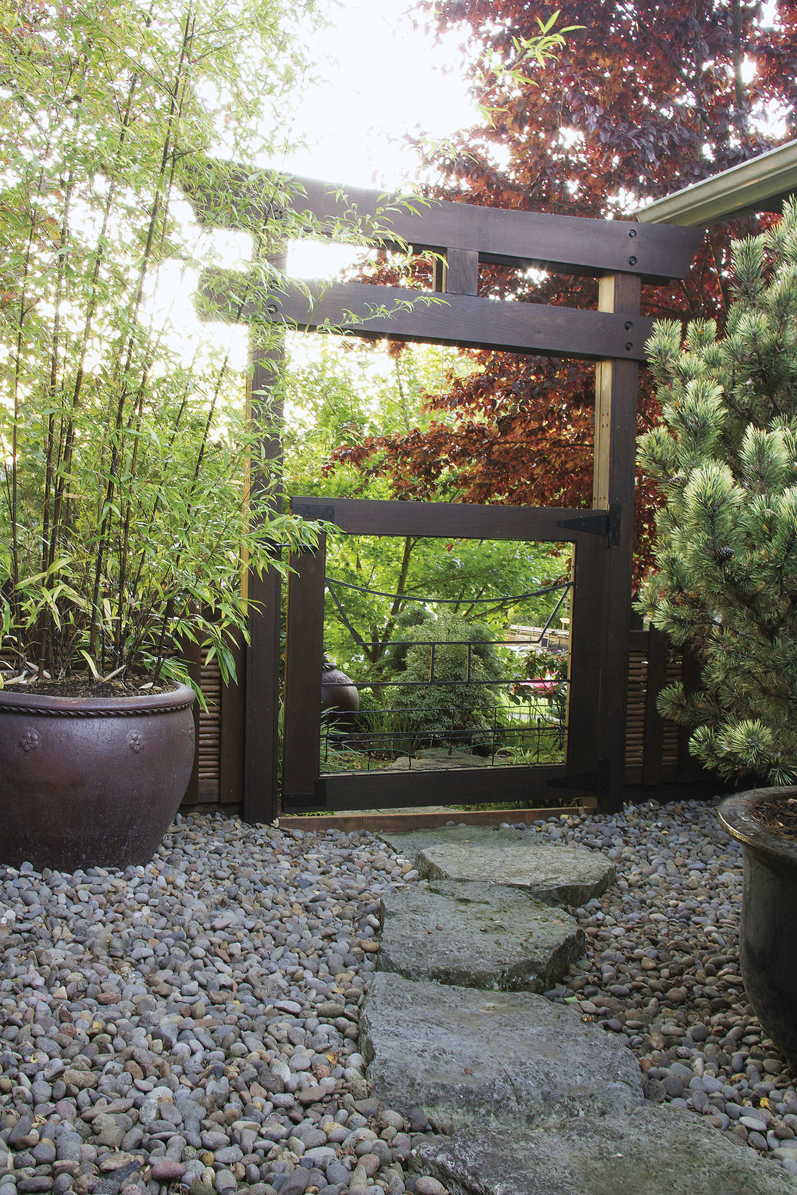
People naturally look right past small spaces, unless something obstructs or focuses their view. Defining boundaries with fences, gates, screens, or focal points keeps the viewer’s attention within a small area. Selecting the right borders can enhance a garden as much as a well-planned seating area or plant palette.
In the Dobsons’ garden, a pair of bamboo screens divides two small garden rooms with distinct purposes: a seating area and a passageway. The screens enclose each garden, holding attention inside that space. In the entertaining area, the screens provide the final walls of the room, making it feel intimate while providing a subtle, textural backdrop for Asian-inspired accent pieces. From within the passageway, the bamboo backdrop keeps visitors’ attention on their journey along the stepping-stone path. By staggering the screens, we created a visual barrier from some perspectives and a framed view from others. When visitors walk toward the screens on the stepping-stone path, new parts of the garden are gradually but continually revealed, drawing visitors into the following space.
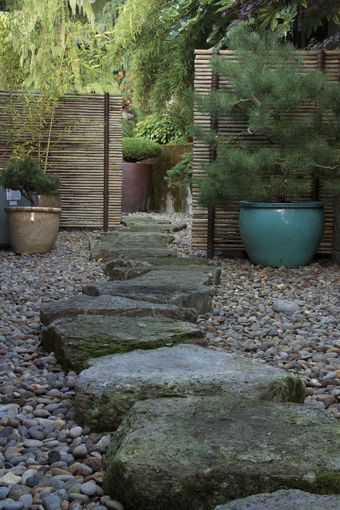
At the opposite end of the passageway garden, stepping-stones bend around a sculptural pine in a large ceramic container (#4). Although this feature is far from a solid barrier, it provides a focal point and a visual stop at the end of the path. Without it, attention would just follow the stone path through the torii gate (#5) and out of the garden. The feature and gate, instead, work together to make a striking backdrop for a peaceful little space.
Disguising the Concrete Without Hindering Drainage
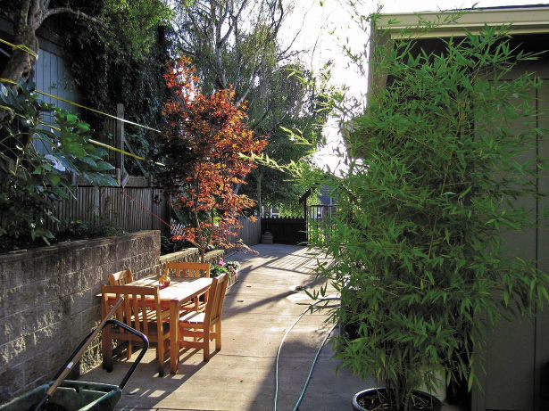
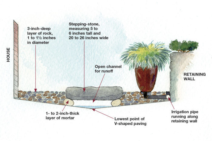
The Dobsons’ original paved backyard was an unusual starting point, to say the least. Although removing the concrete was tempting, the drainage path created by the slightly V-shaped surface was necessary to keep water away from the house. So building over the concrete was our best option.
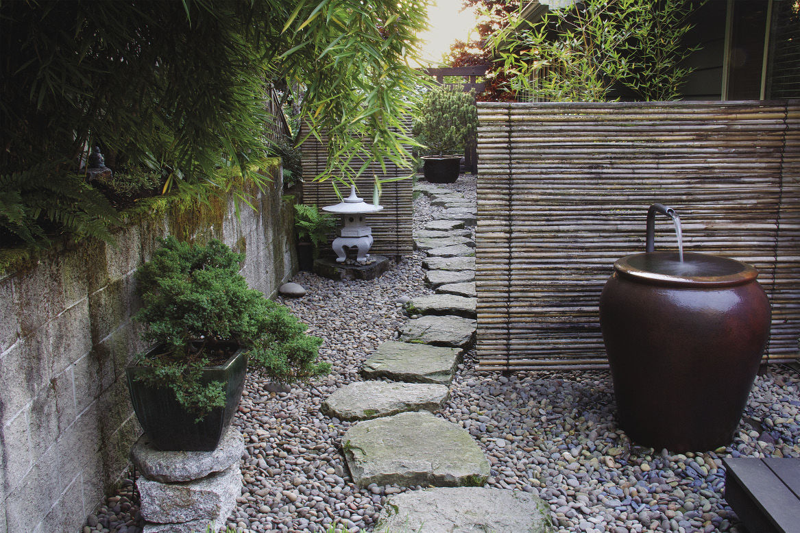
There is no visual sign today of the concrete subsurface, but the original drainage system continues to work perfectly. Small, round river rock covers the pavement and the irrigation piping while still allowing rainwater to run to the drains. This local river rock is both aesthetically beautiful and practical. Due to the rounded shape of the stones, water runs through them quickly, and because the stones are without a powdery surface, they don’t clog the drains with fine particles. This gravel also has a bold texture, which makes it stand out, and a light, neutral color, which nicely contrasts with the garden’s other hardscape elements. Thick basalt stepping-stones, spaced 2 to 3 inches apart and mortared beneath for stability, provide a solid surface for walking or even rolling a wheelbarrow. We borrowed this idea from Japanese gardens, which often have narrow, noncontinuous paths that make visitors move slowly and deliberately through a space, looking down at the path to place their steps carefully and up again to discover new views of the garden. This narrowing of focus enhances the experience of traveling through the Dobsons’ passageway.
Rebecca Sams and her partner, Buell Steelman, own Mosaic Gardens, a landscape design/build company in Eugene, Oregon
Photos: Buell Steelman; Ann E. Stratton; courtesy of Ted Dobson. Illustrations: Beverley Colgan








Comments
Log in or create an account to post a comment.
Sign up Log in