by Marcia Macdonald
February 2000
from issue #25
When I designed the kitchen garden for Arrows Restaurant, which feeds some 12,000 patrons over the course of a season, I was concerned primarily with issues of production—with creating a plan that would ensure not just a massive harvest but also an uninterrupted succession of crops from early spring through late fall.
When you scan the garden at Arrows, you see long rows of butter lettuce, frilly fields of frisée, battalions of baby bok choi. But after building a new house for two years and acknowledging the demanding time constraints of my profession as Arrow’s head gardener, I reconsidered plans for a large kitchen garden of my own on the rocky shores of Cape Neddick, Maine. In reality, I must be able to do all the garden’s weekly maintenance within two to three hours, the wonders of computerized watering systems aiding during hectic morning dashes to nearby Arrows. Yet I wanted to create a garden that would reflect my design capabilities and produce a summer’s bounty of greens, heirloom tomatoes of all sizes and colors, herbs for flavor and fragrance, edible flowers for artistic presentation, and a selection of vegetables, many of which would find their way to the outdoor grill during summer gatherings of friends.
 |
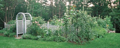
| An archway marks the main entrance to the author’s garden. Its ample depth gives visitors a sense of passing through an enclosure and into a rume that’s distinct from the world outside. |
I had one more big demand for my garden. It had to allow for experimentation and discovery, without losing its sense of identity. I like to experiment, to try new plants and varieties, unusual colors, uncommon plant combinations. Some work, some don’t, and that’s okay with me. I like to be surprised. And yet I appreciate continuity and structure, a garden that is reassuringly dependable and at least somewhat predictable.
I came to realize that drawing up and working from a formal garden plan would allow me to achieve all of my seemingly conflicting goals.
Balancing formality with spontaneity
Having studied garden design in England, I harbored visions of Rosemary Verey’s beautiful Barnsley House potager, interspersed with flashes of the vast, formal, geometric patterns of the potager at Villandry, in France. I wanted the clarity, planting coherence, ordered appearance, and ease of harvest and maintenance that formality in a garden design offers. Geometric patterns combined with the sculptural effects of carefully placed perennial plantings would visually carry the garden through the winter months. Yet I also love the informality and spontaneity of the English cottage garden, with herbs and flowers that spill over walls and beds into pathways, softening hardscapes and fusing colors and textures.
 |
|
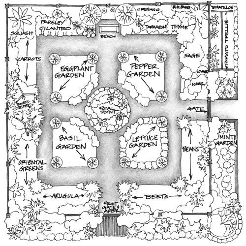
| A detailed working plan helped determine the form of the garden as well as the placement of the plantings. Click here to enlarge this image. | |
With these thoughts in mind, I drew up a plan for a garden room 32 feet square, with raised beds in geometric patterns separated by pebbled paths wide enough to provide maintenance with a wheelbarrow and garden cart. After working weeks on a design grid that would produce a visually pleasing yet efficient and productive pattern, I realized that my final design, in fact, resembled one of the planting grids at Villandry.
Harmonizing color and form
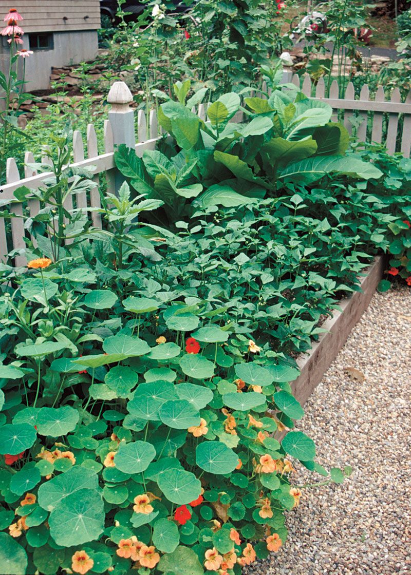
As I drew up my plan, I kept color and form firmly in mind. I decided to place two long beds of mostly perennials outside the garden room itself, along the two sides closest to the house. This break with the traditional four-square form has an impact from both within and without the garden room. From inside, the tall, colorful plantings in the exterior beds form a backdrop for the mostly shorter edibles in the raised beds. From outside, the exterior beds help conceal the garden, providing a greater sense of enclosure and mystery, and heightening the sense that you are entering a room, because you must pass through the outside beds when entering either gate.
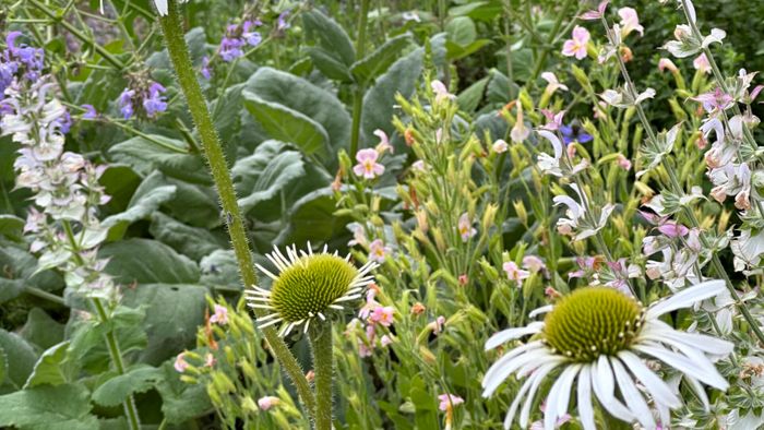
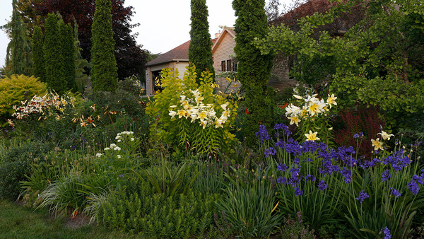
The color of the house—natural cedar shingles with a weathered stain—is reflected in the color of both the fence and the raised beds that I had cut at a local saw mill. The neutral gray and wood tones are a perfect background for a summer color scheme of soft pinks, white, and subtle blues in the exterior beds. In spring, a mass of daffodils and narcissus in soft peach, pale yellows, and white heralds the start of the gardening season. Wonderful antique single hollyhocks, pinkish-buff foxglove, fragrant ‘Miss Lingard’ phlox, ‘Alaska’ Shasta daisies, echinacea (purple and white), delphiniums, and ‘Casa Rosa’, ‘Snow Queen’, and ‘Casa Blanca’ lilies stand tall against the fence. The arched arbor entrance is flanked by two ‘Sir Thomas Lipton’ white climbing roses that will, in time, cover the arbor framing the gate, further enhancing the main entrance to the garden room.
The side gate supports two David Austin ‘Kathryn Morley’ roses and is flanked on the left by a mint garden and on the right by a trellis of heirloom tomatoes and plantings of tomatillos, sunflowers, and herbs like borage and sorrel. I wanted these beds that surround the kitchen garden room to become a soft frame for the geometric pattern within, especially when viewed from the house.
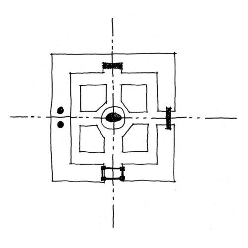
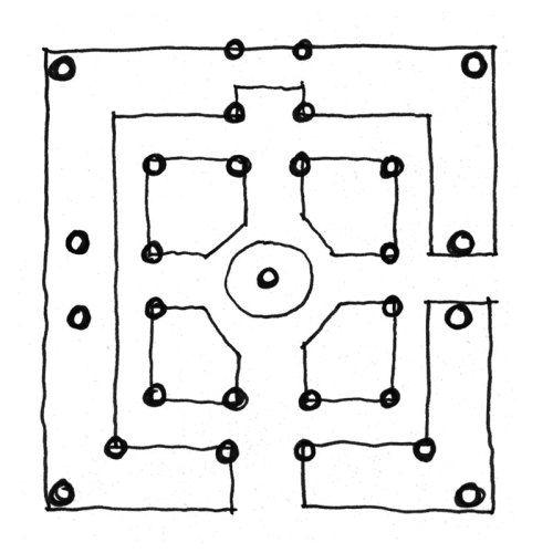
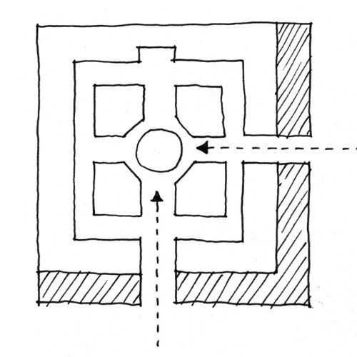
| Four views of the garden’s form | |
 |
Field vs. ground |
 |
Structural elements |
 |
Axis and focal point |
 |
Enclosure and entry |
A dance of planned and unexpected
To achieve a cottage-garden effect, I planned ample space for flowers along with the food crops, as well as pockets in each bed within which I could add whatever plants caught my fancy. For instance, I planned a bed with a squash hill anchoring one end, nasturtiums anchoring the other, and a tomato tepee holding down the middle, but I left room in between for spontaneity: carrots and greens the first year, then who knows what. The solid structures—the raised beds, the fence, the gates, the arbor—liberated me to pursue my fancy and to allow some of my plants to run wild, all without diminishing the coherence of the garden.
In preparing a planting list of vegetables, greens, and herbs, I had only to return to Arrows’ garden. After growing 43 kinds of greens at Arrows, I was clearly able to select my very favorites, not only for delectable taste, but also for just the right visual statement.
 |
|
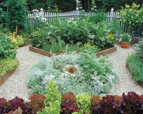
| Raised beds are an integral part of the design.The four inner beds are just 10 inches high to help accentuate the 12-inch-high beds along the fence. | |
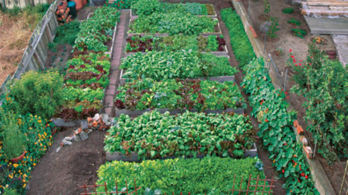
Raised beds are an integral part of the design. I made the beds around the inside of the fence 12 inches high, and the four inner vegetable beds 2 inches lower to accentuate the colors and shapes of the perimeter beds. Each of the four inner beds is accented by formal corner plantings of boxwood ‘Green Velvet’. The inner edges of the beds are softened by a combination of thymes and lavenders that echoes the center garden.
In deciding what to plant in the inner beds, the visual feast became as important as my culinary demands. Eggplants ‘Turkish Orange’, ‘Kermit’, ‘Asian Bride’, ‘Tango’, ‘Orient Express’, ‘Little Fingers’, and ‘Violette di Firenze’, which run the gamut of color, shape, and foliage texture, are in the first quadrant. In the second quadrant is a selection of peppers (my husband’s request), from tall, sweet bells to poblanos, Anaheims, and serranos, to a border of small, colorful, decorative ‘Pretty in Purple’. Rows of colorful scented basils, ready for salad garnishes and pestos, make up the third quadrant. And, of course, lettuces in ever-changing patterns—‘Samantha’, ‘Simpson Elite’, ‘Cocarde’, ‘Merlot’, ‘Freckles’, ‘Vulcan’—fill the fourth quadrant.
The center of the garden needed to be an axis and a focal point, but also had to be low and to contain soft neutral tones to set off the dramatic changes beyond. Still undecided on just the right design, I came home one evening to find a huge earth mover carefully lowering a beautiful granite sculpture with a bird bath into the center. A friend’s gracious gift became the perfect focal point for the cobble-ringed circle of silver herbs—artemisias, rue, curry, and sages, accented with annual licorice plant (Helichrysum petiolare), and dusty millers—that spills out softly onto pebbled paths.
 |
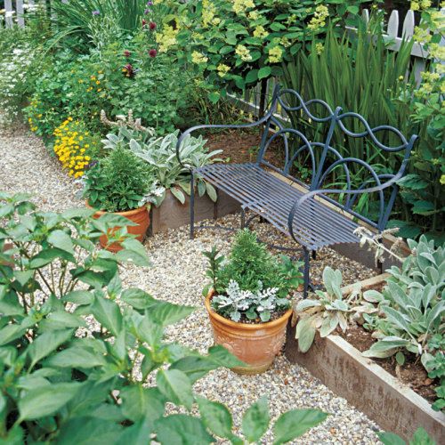
 An alcove opposite the main entrance is just the spot for a French antique iron bench (above). A fence (left) reinforces the feeling of the garden as a room. Working with a local fence company, the author designed the scalloped pickets and the finials. |
|
Now that I’ve lived with the garden for two seasons, would I deviate from my plan and change anything? Of course! That’s the wonderful and ever-challenging part of this art form we call gardening. Perhaps a nursery bed on the slope behind. Or how about a sunny greenhouse? And hen there’s next year’s dwarf fruit tree allée from the side gate, a path to gardens beyond. . .
Fine Gardening Recommended Products
Buffalo-Style Gardens: Create a Quirky, One-of-a-Kind Private Garden with Eye-Catching Designs
Fine Gardening receives a commission for items purchased through links on this site, including Amazon Associates and other affiliate advertising programs.

A.M. Leonard Deluxe Soil Knife & Leather Sheath Combo
Fine Gardening receives a commission for items purchased through links on this site, including Amazon Associates and other affiliate advertising programs.
Gardener's Log Book from NYBG
Fine Gardening receives a commission for items purchased through links on this site, including Amazon Associates and other affiliate advertising programs.













Comments
Log in or create an account to post a comment.
Sign up Log in