In the magazine, space limitations preclude identifying all the plants in the photos, but online, we can do better. Click on the links below to see plant IDs for photos in selected articles. We didn’t name everything, but it’s a start.

Faced with the daunting prospect of landscaping a two-acre hillside with a 20-ft. drop, master gardener Donna Tetiva of Sequim, Washington, rose to the challenge. In her article “Impress from a Distance” in the September/October 2012 issue of Fine Gardening (#147), she reveals how she developed a pleasing design solution that minimized the problems of weeds, erosion, and maintenance.
- Impress from a Distance
(three photos)

Most garden beds get a mix of sun and shade, and that can easily lead to a chaotic mishmash of plants. In the article “One Bed, Two Exposures Beautifully Blended” in the July/August 2012 issue of Fine Gardening (#146), garden designer Faye Beck, of Knoxville, Tennessee, explains the concept of “exposure twins” and how she applied it to create a cohesive garden design for a bed that runs from full sun to deep shade.
- Designing for Sun and Shade (four photos)

Contrast is a fine strategy for creating an enticing garden, but too much of it can be a bad thing, says garden designer Sharon Nyenhuis, of Sequim, Washington. In the her article “Concentrate on Contrast” in the May/June 2012 issue of Fine Gardening (#145), Sharon explains how she creates contrast through the use of color, texture, and size.
- Concentrate on Contrast (five photos)

Sandi Burdick and her husband Tom Boyd landscaped their hillside garden in Knoxville, Tennessee, to look good from almost any vantage point. Her design goes way beyond stepped terraces. To learn about their design strategies, read “Designing with Curved Terraces” by Sandi Burdick in the January/February 2012 issue of Fine Gardening (#143).
- A Hillside Garden that Looks Good from Any Angle (four photos)

When garden designer Erin Ray and her husband moved to a Portland, Oregon, house with sloping front and back yards, they completely redid the landscaping, and the results are impressive. In “From a Useless Slope to a Luscious Garden” in the September/October 2011 issue of Fine Gardening (#141), Erin explains the changes they made and offers design suggestions to others faced with a similar situation.
- Garden Design on a Slope (two photos)

Faye Beck’s front-yard garden is brimming with plants. In “Stand Out without Sticking Out” in the May/June 2011 issue of Fine Gardening (#139), you’ll discover how she developed her plantings, yet still was able to maintain a harmonious relationship with her neighbors’ lawns.
- A Tennessee Front-Yard Garden (two photos)

Oregon landscapers Bryan and Cassandra Barrett share their design expertise in “Two Secrets to Great Design” in the March/April 2011 issue of Fine Gardening (#138).
- Two Secrets to Great Design (five photos)

In the January/February 2011 issue of Fine Gardening (#137), Minnesota nursery owner Dean Engelmann describes his strategy for “plant linking,” by which one can integrate annuals into beds with perennials, trees, and shrubs.

The November/December 2010 issue of Fine Gardening (#136) visits a bog garden on the shores of Lake Michigan, where Barbara Weirich and her husband turned a murky, wet depression into a good-looking home for moisture-loving plants.
- Bog Garden: From Muddy to Magnificent (four photos)


In the September/October 2010 issue of Fine Gardening (#135), Nancy J. Ondra (“Plan for an Awesome Autumn”) offers plant choices and design suggestions for ending the garden season on a high note. Cindy Stockett (“Tying It All Together”) takes on a tricky topic: how to unify the various beds and sections of your gardening space in a coherent design scheme.
- Plan for An Awesome Autumn (one photo)
- Tying It All Together (eight photos)
Fine Gardening Recommended Products

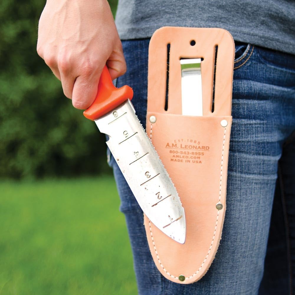
A.M. Leonard Deluxe Soil Knife & Leather Sheath Combo
Fine Gardening receives a commission for items purchased through links on this site, including Amazon Associates and other affiliate advertising programs.


Comments
Interesting article. I was interested in the fact that the photo shows good design when planting plants. As a web designer, I want to say that this is very attractive and makes you want to visit such a garden. I remember I was developing a website design for a store selling plants, it was difficult for me, I spent a long time selecting both photos and fonts, bought graphic sets on https://masterbundles.com/ I'm sorry I didn't see your photos before, they would perfectly complement the home page of the site which I was working on. These photos are great.
Log in or create an account to post a comment.
Sign up Log in