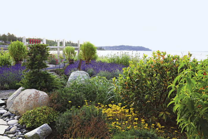
It seems like many planting designs are all about blocking things you’d rather not see: the street out front, the nosy neighbors, or the messy lot next door. After all, why would you ever want a landscape that stays under 3 feet tall? Perhaps it’s to preserve a view, or to avoid traffic mishaps (i.e. backing out of the driveway into oncoming traffic), or maybe it’s to create interest along a pathway or narrow expanse without obscuring the destination. These were all issues I faced at a seaside property in Washington. My plan needed to be low profile so the plants could better withstand the abuse of a windy, shoreline location, too. I found that the keys to a successful design were solid, large-scale hardscaping paired with thoughtful, dense sweeps of plants.
Use Sweeps of Fine Texture and a Simple Color Palette
The first thing I noticed about this property was the beautiful sweeping views of the water, mountains, and sky. The second thing I noticed was the large, long house that sits on a finger of land surrounded on both sides by water. The challenge became creating a landscape that would blur the lines between the hulking building and the surroundings.
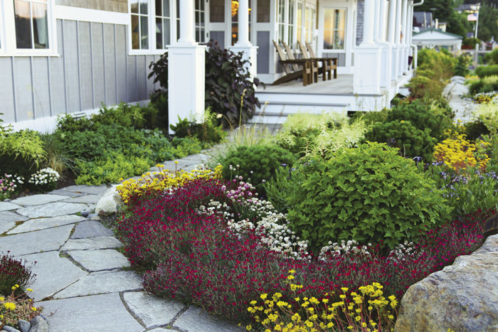
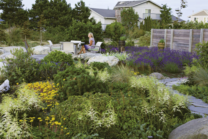
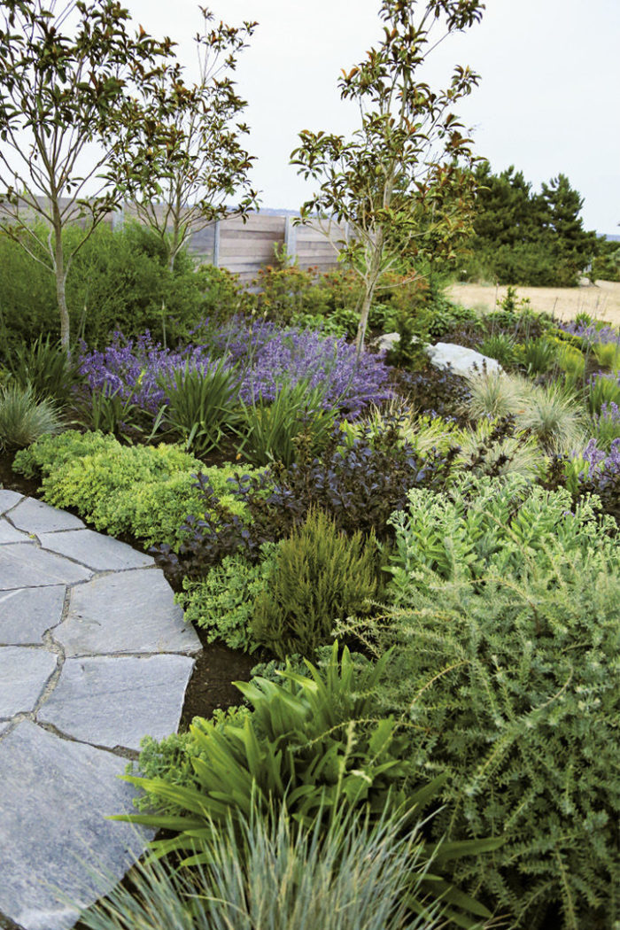
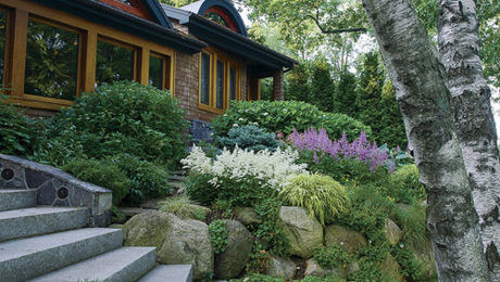
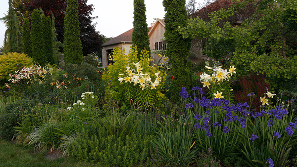
In order to preserve the view from the house, I decided that the majority of the plants needed to be less than 3 feet tall. This size restriction was important along the driveway, too, where the plants couldn’t obscure the house entry or the exit to the street. Also, because this site is on the shoreline, short, dense plants would naturally hold up better to high winds. Anything that was taller needed to be sited against the house or in a sheltered courtyard area. The last set of restrictions for the plants in this design involved color. Keeping the colors of the plant palette simple gave their presence greater impact and, because this space was fairly small, I needed all the impact I could get. I primarily stuck to hues of purple with dashes of yellow and white for highlights (photo, below).
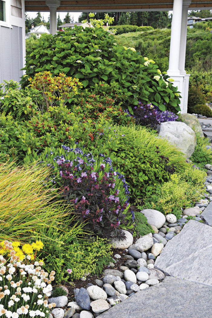
Without lots of color, however, the texture of the plants becomes extremely important. Unfortunately, bold-textured plants can be imposing and overwhelm a low-profile design, so stick with fine texture. Fine texture also adds movement to the space, which adds interest. In other words, bold texture takes up a lot of visual and physical space while fine texture takes up less visual and physical space. To make sure these wispy plants didn’t get lost against the large house, I planted them in large sweeps to balance things out. Planting in sweeps also helped the garden blend into the drifts of native wild rye (Elymus spp., USDA Hardiness Zones 4–9) already in place. I used groupings of fine-textured autumn moor grass and blue oat grass (Helictotrichon sempervirens, Zones 4–8) throughout the garden to mimic the motion and color of the wild rye.
The careful placement of hardscaping is as important as the type of material you choose.
Make the Hardscaping a Focal Point on Its Own
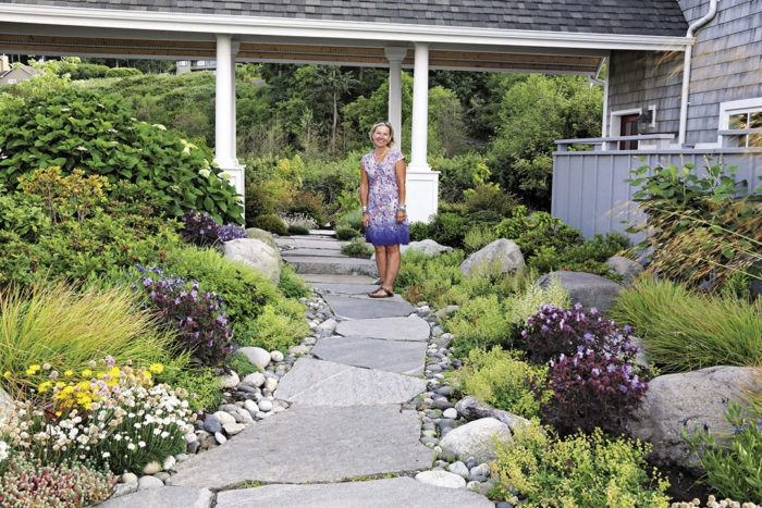
With a simple and somewhat limited array of plants, it’s important that the hardscaping in your low-profile garden is incredible. It often becomes the focal point since you won’t have many (if any) upright plants with an eye-catching form. To make the hardscaping pop you’ll need to choose unique materials, think about careful placement, and be sure to use it in interesting ways. There isn’t one kind of stone used in this garden—there are several. The finishes (rough or smooth) are similarly varied. As with plants, you need to pair hardscaping materials with different textures, colors, and forms to get contrast. I used shimmering slabs of quartzite flagstone, which has bits of natural mica in it and tends to refract light. I also used large, rough-edged boulders, and smooth—almost softball-shaped—river rocks. Any of these materials used alone would look nice, but not incredible. Pairing all of these unique materials, however, allowed the hardscaping to shine as brightly as the plants (photo, below).
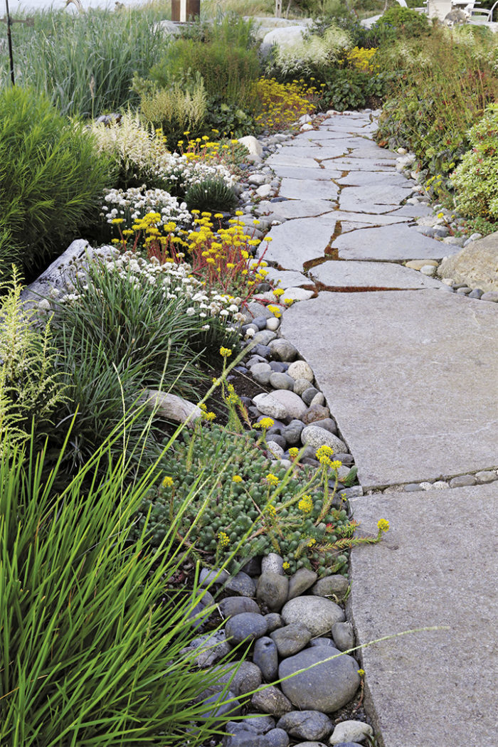
The careful placement of hardscaping is as important as the type of material you choose. Obviously, you need to use it for functional aspects of the garden (pathways or retaining walls), but you don’t want it to overshadow the plants. I used the flagstone slabs for the paths since they gave the walkways weight and substance. The boulders had a dual purpose: providing a buffer from high water and a sheltered spot to protect plants from the wind. They also mimic the surrounding rocky shoreline. Two entry points to the beach are marked with boulders, too. Smooth river rocks offer a transitional step between the hard flagstone edges of the paths and the billowing foliage of the nearby ground covers. ‘Cotton Tail’ thrift and an array of sedums (Sedum cvs., Zones 3–8) each border the pathway (photo, above).
Walkways and thoughtfully placed boulders are two ways to use hardscaping effectively—but if you truly want hardscaping to be a focal point, there are other interesting ways to employ it. Using the glittering flagstone, I created a beachside patio that is an inviting destination point (photo, above). A stone fire pit was built here, too, using similar materials. It’s lower than the surrounding patio and shares space with more boulders—placed strategically for shelter and sitting. Both features draw just as much attention as a tall conifer or specimen tree would—except they’re considerably shorter.
As this landscape matures, the plants grow in community with the hardscape, leaning on one another and creating a garden that relates to its surroundings. What started as space with a height problem turned out to be a stunning garden.
Stats of the Site
Designer: Susan Calhoun
Size: 5,000 square feet
Conditions: Full sun to full shade (depending on location); well-drained soil on top of a sandy native soil base
Years since planting: 5
Challenges: Everything (plants/hardscape) needed to be under 3 feet tall; windy, exposed site with varied light conditions; salt spray from the ocean
Susan Calhoun is the owner of and principal designer at Plantswoman Design on Bainbridge Island, Washington.
Photos: Danielle Sherry; courtesy of Monrovia Nursery. Illustration: Elara Tanguy
Fine Gardening Recommended Products
Spear & Jackson 4930FZ Razorsharp Telescopic Tree Pruner
Fine Gardening receives a commission for items purchased through links on this site, including Amazon Associates and other affiliate advertising programs.
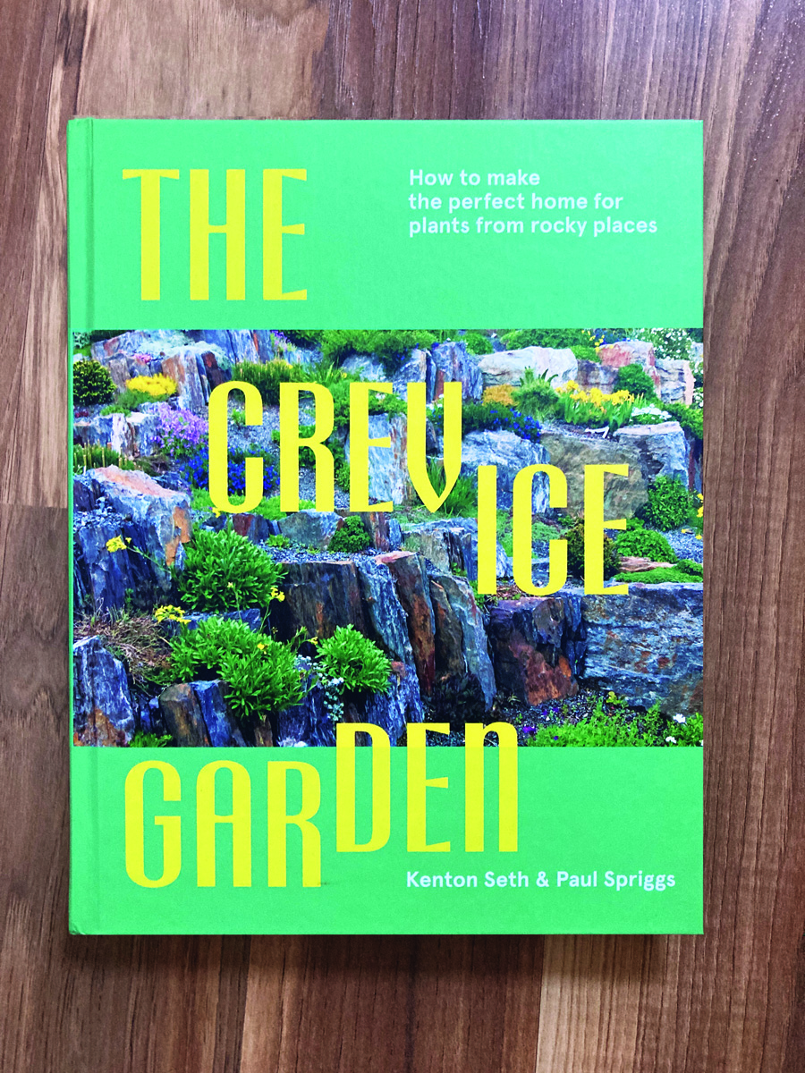
The Crevice Garden: How to make the perfect home for plants from rocky places
Fine Gardening receives a commission for items purchased through links on this site, including Amazon Associates and other affiliate advertising programs.







Comments
Log in or create an account to post a comment.
Sign up Log in