
I’ve been designing gardens for a decade or so, and I’ve been studying them for at least another decade. In addition to traveling to see many gardens, my ongoing teacher has been my own in Los Angeles. I originally asked landscape architect Frances Knight to design it in 1989, and since then, I’ve continued to cultivate and tweak it.
What makes a pleasing garden scene or planting vignette? Often, the reason is harmony. For example, a well-orchestrated symphony of green on green can be quite pleasing. Just as often, however, it is contrast—the opposite of harmony—that makes a garden room or plant combination memorable. The interplay of opposing elements—such as dark and light, symmetry and asymmetry, even chaos and order— can be applied both to a garden’s entire layout as well as to individual plantings.
Classic garden images of contrast include a sunlit lawn surrounding a spreading shade tree, a flowering vine against a flat wall, or roses backed by a clipped hedge. Here are three ways to successfully juxtapose contrasting elements within a garden.
Include both enclosed and open spaces


Photo/Illustration: Judy M. Horton
Any garden can be thought of as a relationship between open spaces and enclosed spaces. Enclosed spaces can be created by architecture, such as walls, arbors, and other structures; by natural landforms, such as hillsides; or by dense plantings. Open spaces can be an expanse of lawn or an unbounded terrace.
The contrast of moving from an enclosed area to an open area is experienced on an emotional level. The feeling is similar to walking through the woods and coming upon a clearing. Varying the relationships between two types of spaces provides a lively experience of moving through a garden.
The layout of my garden contrasts intimate, enclosed spaces with a central open space that is lawn. As you enter the garden, there’s a tiny, irregular terrace with a floor of broken concrete and a café table and chairs. I’ve heightened the informality and feeling of enclosure by growing vines up the trunks of adjacent trees as well as on the side of the house that borders this space. The vines intertwine to form a leafy roof, and the space feels like a wild jungle just outside the “civilized” space of my living room.
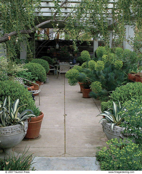
Next, a short path takes you from this intimate space into an area under a generous pergola. The enclosure here is rigid and geometric, precisely defined by the pergola posts, the scored-concrete floor, and the overhead beams. Its sense of formality is heightened by its contrast with the informal, asymmetrical room next to it. The planting is simple, with clipped boxwood balls in pots reinforcing the grid. In spring, euphorbias and climbing roses embellish this classic space and soften the formality. By summer, blowsy hydrangeas further blur the formal lines.
Balance complexity with simplicity

Next to this pergola is a space that opens up dramatically. Roughly 38 feet long by 34 feet wide, it has a rectangular lawn in the center and is enclosed on its long sides by deep (10-foot-wide) mixed borders. The short sides are marked by the pergola at one end and by a similarly scaled portal flanked by two fruit trees at the opposite end. The lawn—only 14 feet wide by 28 feet long—feels quite spacious because it is open to the sky and you come upon it from enclosed, covered spaces. No furniture on the lawn—not even an overhanging tree branch—interrupts this openness.
This space is formal in its shape and scale, which heightens the contrast between the lawn and the exuberant plantings. The lawn invites you to pause and look around to appreciate the garden’s urban setting and a nearby church steeple. In contrast, a narrow edge strip along the lawn invites you to walk slowly by the borders and notice individual plants. This 2-foot-wide edge of broken concrete separating the lawn from the flower beds reinforces the geometry of the lawn while also serving as a path. Plants spill out of the beds onto the concrete, but this edge keeps the plants from extending as far as the lawn and spoiling its precision.
The simplicity of the layout of my lawn area allows for another type of contrast: the intricate plantings highlighted in the adjacent flower borders. In any setting, strong colors and starkly contrasting elements show to their best advantage when they are tempered by simple elements.
In addition to having a foreground of the lawn and path, my flower borders are backed by either a clipped hedge or a 6-foot-high fence. These elements set off the plants, much like a simple frame does around a colorful painting. Placing varied, interwoven plantings against a plain background and foreground makes it easier to enjoy the plants.
Contrasting complexity and simplicity can be used in the overall design of any planting. The variety created by combinations of flowering plants can be presented against a mass of solid green or dark-colored foliage, a simple fence, or a wall painted a single color.
Combine opposing elements within plantings


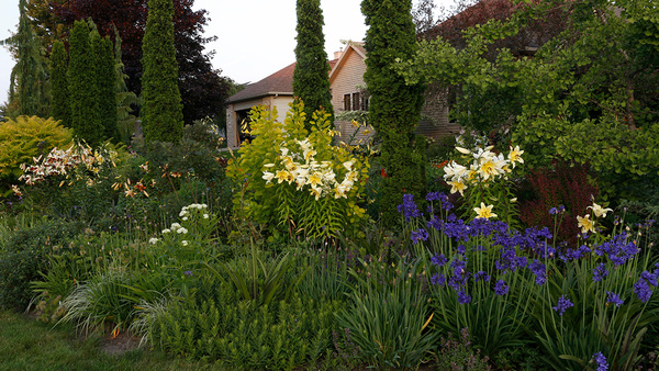
I like to grow a variety of plants and to use a broad color palette. Both of my 28-foot-long borders are planted informally and asymmetrically, and each has its own color scheme. But unity is achieved by a careful limiting of the color palettes within specific areas and by balancing the overall informality with some formal elements. I’ve used small trees and clipped boxwood and myrtle balls to divide each of the borders into three sections. The unifying theme of my entire garden is fruit, and each border has two trees.
The south-facing border has an orange tree and a pomegranate tree.I call this my “hot” border, with each section consisting of three colors: The first section is purple, red, and orange, with red roses dominating; the second is orange, yellow, and blue, with the orange tree dominating; and the third is orange, yellow, and red, with the pomegranate tree as the star.
The north-facing border, which includes an apple tree, is my “cool” border. There’s lots of white, pink, and burgundy here, but it gets lively at one end where a persimmon tree balances the pomegranate on the opposite side and a yellow-orange rose (Rosa ‘Lady Forteviot’, USDA Hardiness Zones 5–9) covers the portal adjacent to it.
On both sides, I include plants with burgundy, chartreuse, and gray foliage. These recurring colors—along with the repetition of roses, fruit, and spiky plants on both sides—help connect the contrasting color schemes. Another design trick is to use a single color in a section of a border— say, 6 feet square or larger—but with different flower shapes. In one area, I have red roses underplanted with Penstemon ‘Firebird’ (Zones 7–10). Another planting design strategy I use is to pair plants with starkly different forms that have something in common. A favorite combination is purple fountain grass (Pennisetum setaceum ‘Atropurpureum’, Zones 9–10) with brown-eyed Susan (Rudbeckia triloba, Zones 4–9); the eye of the brown-eyed Susan is the same color as the grass.
In complex plantings, I find it helps to start with one or two key plants and then build combinations around them all the way down to the ground covers. Then I move on to the next section, picking something from the first section (a color, a plant, or a shape) to include in the second grouping, and so on. This helps keep a border from having too much contrast, which can seem visually jarring.
The possibilities for using opposing elements in a garden go on and on— hard against soft, white or gray foliage against green foliage, fine texture against coarse. A combination at the entrance to my pergola has all these: bold, spiky, gray-and-white agaves in an ornate concrete urn next to a finetextured clipped boxwood ball in a simple terra-cotta pot. It’s a vignette that epitomizes my fondness for well-placed opposites.
Fine Gardening Recommended Products

A.M. Leonard Deluxe Soil Knife & Leather Sheath Combo
Fine Gardening receives a commission for items purchased through links on this site, including Amazon Associates and other affiliate advertising programs.








Comments
Log in or create an account to post a comment.
Sign up Log in