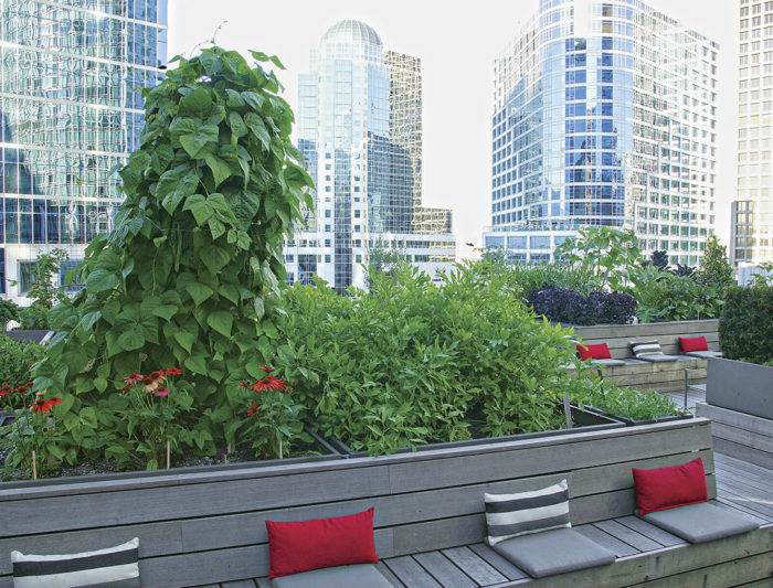
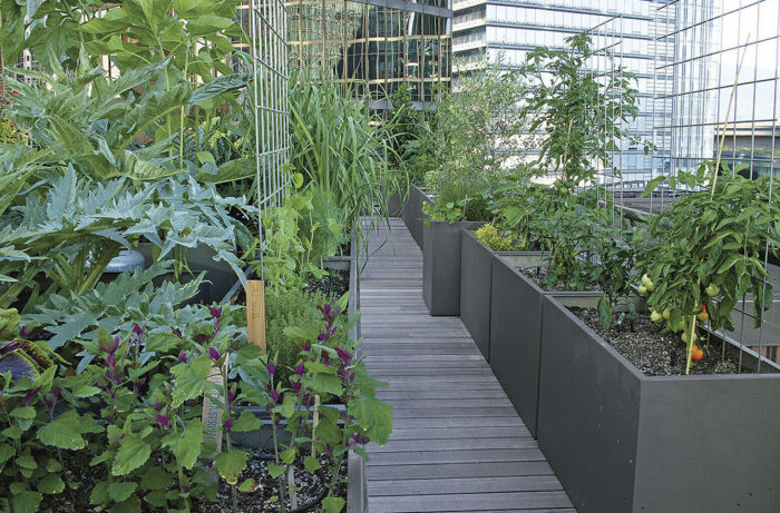
The task was a bit overwhelming: Design and create an edible garden that was productive enough to supply produce for a restaurant, make sure it looked beautiful most of the year, and make it exciting and engaging—not only for gardeners like me but also for someone who has never held a pair of pruners. Oh, and did I mention that all of this had to happen on a city rooftop? This was the challenge presented by the Vancouver Club, a private social club in the heart of downtown Vancouver, British Columbia. The opportunity provided me with a platform for something I had never tried before—to create a new kind of vegetable garden, one that had an attractive modern aesthetic and was superproductive. So, designer David Hepworth, builders from Conex Construction, general manager of the club Philip Ireland, and I got together and decided the best way to accomplish that goal was with a gridlike layout that would keep things organized and inviting at the same time.
Beds and pathways set the tone
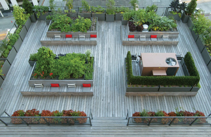
A common issue for many vegetable gardens is that they’re built solely for production, with little thought given to the overall design of the space. This leaves them looking messy or, worse still, unsightly. That wasn’t an option for the Vancouver Club project, so a gridlike layout was planned instead—which led to a more organized and visually appealing garden. That meant keeping things entirely linear. Working with David Hepworth, we decided on a series of custom-built rectangular raised beds, fabricated out of powder-coated stainless steel. These were installed in straight lines, which led to the general layout of the space being a series of clean and concise lines. Straight paths, which are inevitable when you keep the raised beds geometric, make the garden seem more accessible because there is a clear journey through the space.
Even if you don’t have a stunning city skyline surrounding your garden, it’s still important to keep clear sight lines throughout the space. This encourages people to wander into the garden and draws them from one spot to the next. The sight lines in this space enable you to see from one end of the garden to the other easily, from virtually any angle. Open sight lines also give the space an open floor-plan appearance, which makes the space feel larger despite it only being 36 feet long and 51 feet wide.
Planting in blocks keeps things organized
Vegetable gardens have a tendency to be a jumbled assortment of plants spilling over in all directions without rhyme or reason. This usually leaves them feeling chaotic, and that disorganization can cut down on the productivity of the space, as well. If you can’t find the squash to harvest, then chances are it’ll be the size of a baseball bat before it’s noticed. When it came to filling up the individual raised beds, I planted everything in blocks or rows, further enhancing the linear design. This helped keep things looking neat and organized.
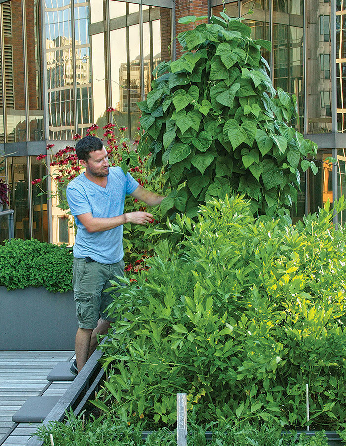
I kept the plantings in the middle beds low, which allows you to see from one end of the garden to the other (keeping the established sight lines clear). The exception to the height rule is the tepee of beans toward the middle of the garden, which I use as one of the main focal points. Without these types of focal points, the space may appear as a less interesting plane. Tall vining veggies (like indeterminate tomatoes) are kept neat by trellising them along a flat metal fencing panel—giving the appearance of a living wall. They’re mostly relegated to the outside edges of the space, again, keeping the sight lines open.
The rest of the garden is planted in rows and blocks based on the plants’ color and texture—and keeping in mind what the club’s chef, Sean Cousins, needed for ingredients. When it’s time to switch out a crop as the seasons change, I try to replant something with contrasting color or texture to keep things visually interesting. And, although this is a rooftop vegetable garden, it does have bones like any ornamental landscape. A few small trees, such as bay laurel (Laurus nobilis, USDA Hardiness Zones 8–11) and olives (Olea europaea, Zones 8–10) play a permanent role. These are relegated mostly to planters placed at the corners of the roof, where they can’t obscure the sight lines.
Seating makes the space warm and inviting
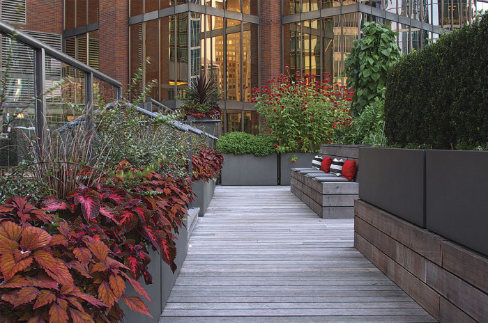
A grid like layout and clear lines of sight can help draw people into the space, but straight lines can also feel rigid. So, once you pull people into the space, you obviously want to provide some place for them to stop, get comfortable, and admire the cherry tomatoes. This is why it’s important to make sure there are seating areas.
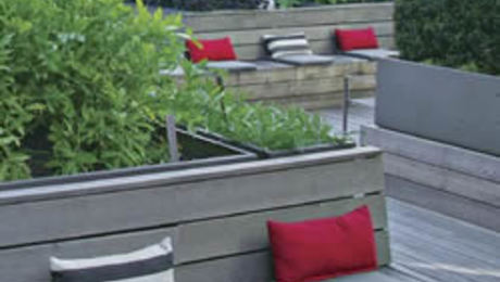
The built-in benches attached to the raised beds were a must, so visitors would be encouraged to actively use the outdoor space to discuss business or meet with friends. The space became so inviting, in fact, that parties are now a regular occurrence in the garden. The built-in seating also prevents anyone from having to move seating in and out to accommodate for these functions.
When I look at this unique garden, I’m almost able to forget how much work it took to bring up to the roof all 55 stainless-steel planters, 18 pallets of soil and drainage material, and scores of plants. This space proves that regardless of where you’re installing your edible garden, a linear design will make it beautiful and productive.
The Raised Bed Specs
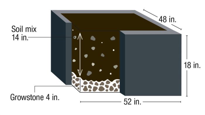
All of the planters on the island beds are the same height with varying lengths and widths. We added 4 inches of Growstone (recycled-glass growing medium) to the bottom and filled the rest of the containers with a customized soil blend (50% aggregate to 50% potting soil). I wanted at least 14 inches of soil depth to ensure good root growth. Growstone absorbs water, so I used it as a drainage material. It also provides a reserve of water if the soil becomes dry. The result is a series of moist, well-drained beds.
Edible Plant Pairings That Don’t Disappoint
Whenever possible, I try to make the most of the contrasting color and textures of edibles. Pairing herbs, vegetables, and fruits can be just as visually rewarding as pairing annuals and perennials. The following are a few of my favorite edible combinations throughout the season.
Contrasting foliage for fall
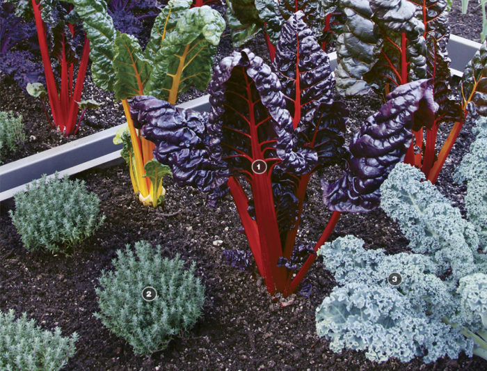
Flowers are generally hard to come by in autumn, so the vibrant chard is the perfect alternative for a shock of color. Its hue and texture are perfectly offset by the surrounding cool-hued (and fine-textured) thyme and kale.
1. ‘Bright Lights’ Swiss chard (Beta vulgaris ‘Bright Lights’, annual)
2. Thyme (Thymus cv., Zones 5–9)
3. ‘Dwarf Blue Curled’ kale (Brassica oleracea ‘Dwarf Blue Curled’, annual)
Edible and abundant winter interest
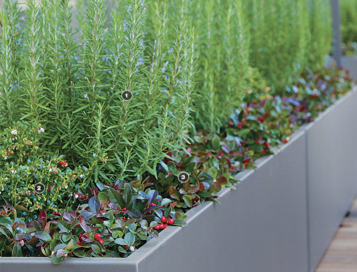
These plants look good year-round and are evergreen in mild zones. The fine-textured rosemary and ligonberry offer contrast for the bold, wintergreen foliage. The latter two plants also add a pop of color with their bright fruit.
1. Rosemary (Rosmarinus officinalis, Zones 8–11)
2. Ligonberry (Vaccinium vitis-idaea, Zones 2–6)
3. Wintergreen (Gaultheria procumbens, Zones 3–8)
A summer balance of bold blooms 

Two of the showiest herbs out there are borage and nasturtium. Their eye-catching flowers are balanced in this combo by the ruffled foliage of the parsley and perilla.
1. Borage (Borago officinalis, annual)
2. ‘Dwarf Cherry Rose’ nasturtium (Tropaeolum majus ‘Dwarf Cherry Rose’, annual)
3. ‘Par-Cel’ cutting celery (Apium graveolens var. secalinum ‘Par-Cel’, annual)
4. Purple perilla (Perilla frutescens* ‘Atropurpurea’, annual)
Todd Holloway is the owner of Pot Inc., a plant design firm and creator of premium landscape and garden planters in Vancouver, British Columbia.
Photos: Danielle Sherry. Illustration: Abigail Lupoff.
Fine Gardening Recommended Products

SHOWA Atlas 370B Nitrile Palm Coating Gloves, Black, Medium (Pack of 12 Pairs)
Fine Gardening receives a commission for items purchased through links on this site, including Amazon Associates and other affiliate advertising programs.
A.M. Leonard Deluxe Soil Knife & Leather Sheath Combo
Fine Gardening receives a commission for items purchased through links on this site, including Amazon Associates and other affiliate advertising programs.
Gardener's Log Book from NYBG
Fine Gardening receives a commission for items purchased through links on this site, including Amazon Associates and other affiliate advertising programs.











Comments
Log in or create an account to post a comment.
Sign up Log in