Photo/Illustration: Michelle Gervais
Photo/Illustration: Michelle Gervais
Photo/Illustration: Michelle Gervais
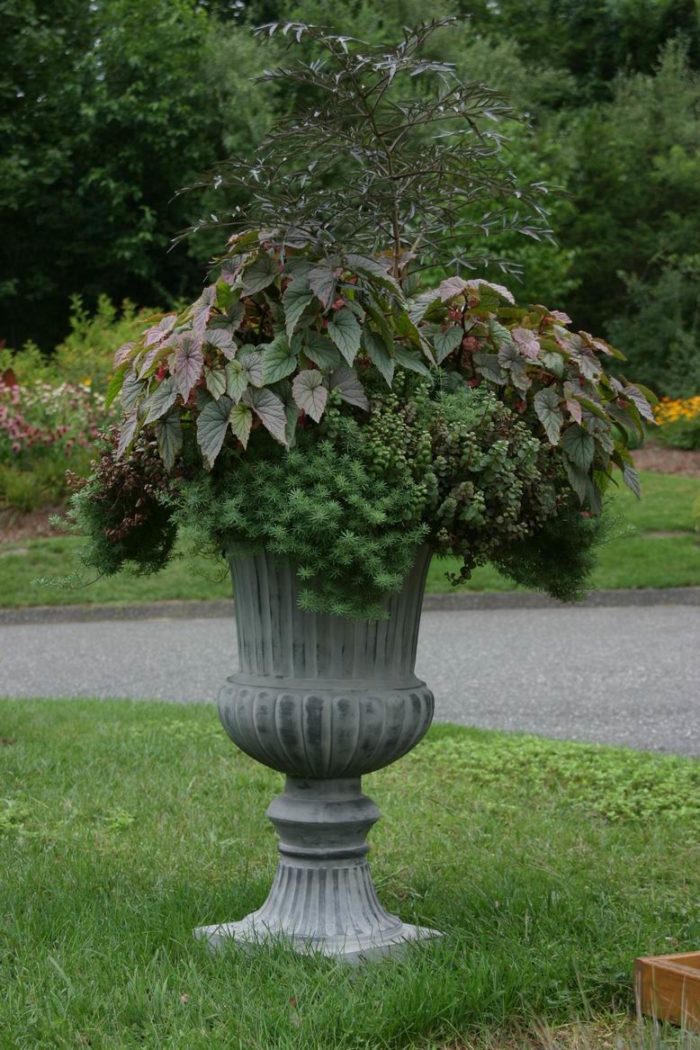
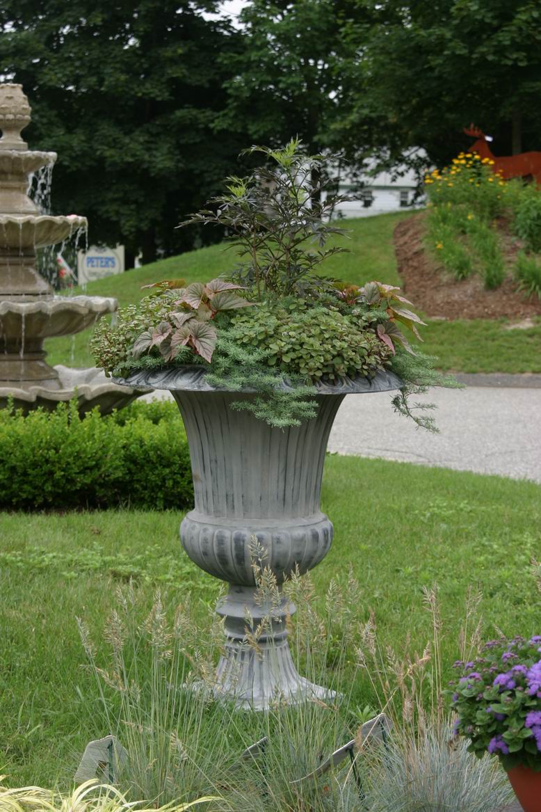
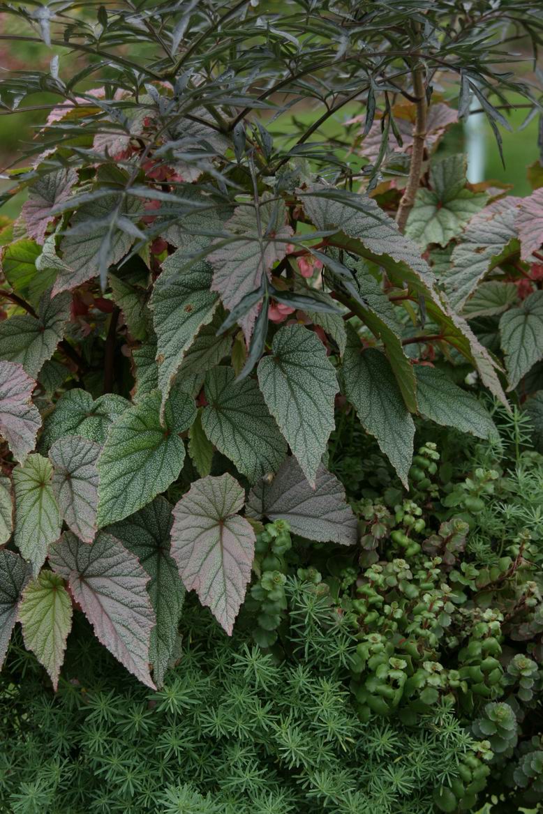
This dusky container design is quietly dramatic. It was designed by Peter Robideaux and his staff in Brookfield, Connecticut, to be an example of what could be achieved with the plants he sells in his nursery, Peter’s Home and Garden. They chose to stick with deep and blackish greens, which harmonize with the stunning urn, and played with contrast to make an impact. Take a look at the before and after photos to see what a difference water, fertilizer, and a couple of months makes.
To learn a no-fail container design technique, click here!
Welcome to the Fine Gardening Garden Photo of the Day blog! Every weekday we post a new photo of a great garden, a spectacular plant, a stunning plant combination, or any number of other subjects. Think of it as your morning jolt of green.
Sign up to get new posts delivered to your inbox each morning so you’ll always remember to take a look, or add us to your RSS feed. We look forward to sharing our garden travels with you.
If you think you have a photo that we should share on the Garden Photo of the day, email us. Send hi-res images to [email protected] with GPOD in the subject line. We’ll only respond if we plan to use your photo.
Fine Gardening Recommended Products

A.M. Leonard Deluxe Soil Knife & Leather Sheath Combo
Fine Gardening receives a commission for items purchased through links on this site, including Amazon Associates and other affiliate advertising programs.









Comments
While i am all for "dramatic", this arrangement is too monotone for me. Rather than the busy airiness of a sambucus Black Lace coming out of the top, i'd much prefer to see a bolder shape and form for the dominant plant- like Canna Red Stripe.It also would bring a needed verticality to the piece. The somewhat one-note duskiness in the base/skirting plants would liven up with the inclusion/substitution of Acorus or hakonechloa All Gold or lysimachia numularia aurea or.......
best,
Mindy
http://www.cottonarboretum.com/
Contrary to arboretum, I like the almost monoculture of this composition. There are subtle "conversations" going on between the foliage textures, especially the larger leaves at the top. There's a time for splash and dash, but at close range, I like to soft-pedal (or is that petal?) the intensity. Thanks for posting.
Log in or create an account to post a comment.
Sign up Log in