
Photo/Illustration: Allan Mandell
Photo/Illustration: Ann Stratton




Photo/Illustration: Allan Mandell

Photo/Illustration: Ann Stratton


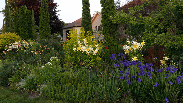
There’s no doubt about it: Fine Gardening features a great many gardens between its covers every year. Only a handful, however, are offered as lessons in garden design. Find the eight gardens we brought to you in 2012 below, and vote for the one that you felt most compelled by.
Bonus: After casting your vote, leave a comment explaining your choice, and you could win a copy of our Front Yard Idea Book! Enter by January 1, 2013.
 |
 |
 |
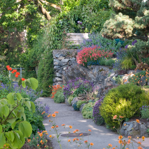
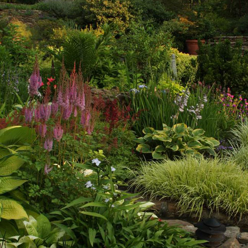
| Designing with curved terraces by Sandi Burdick, issue #147 | Focus on seasonality by Dennis Schrader, issue #148 | Simplify your color scheme by Andrew Grossman, issue #144 |
 |
|
 |
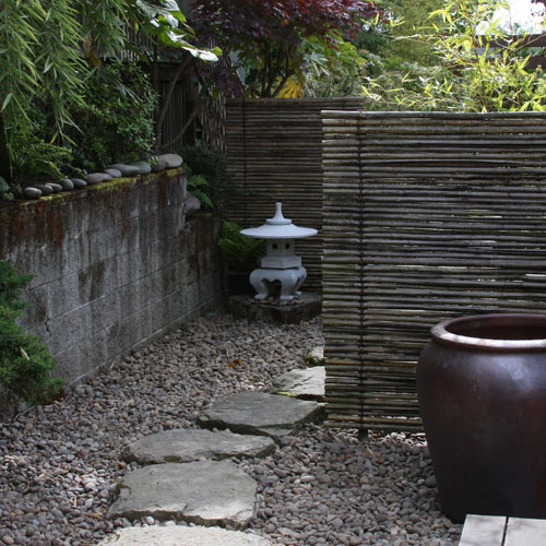
| Impress from a distance by Donna Tetiva, issue #147 | Design ideas for a small space by Rebecca Sams, issue #145 | |
 |
 |
 |
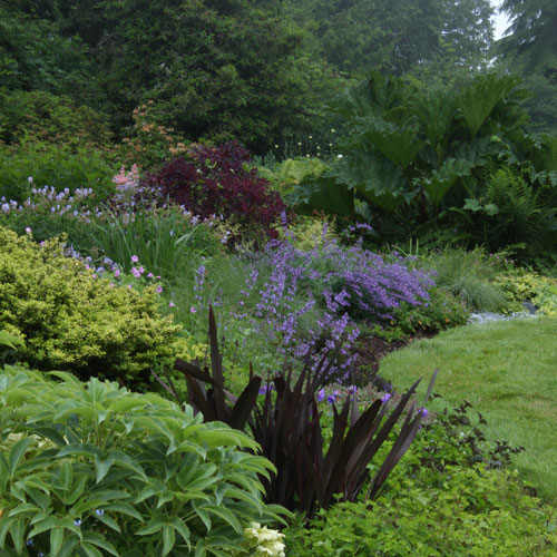
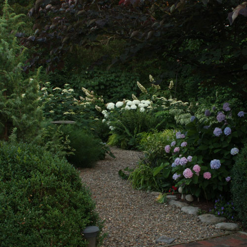
| There’s more than one way to be bold by Antonio Reis, issue #146 | One bed, two exposures beautifully blended by Danielle Sherry, issue #146 | Concentrate on contrast by Sharon Nyenhuis, issue #145 |
Fine Gardening Recommended Products
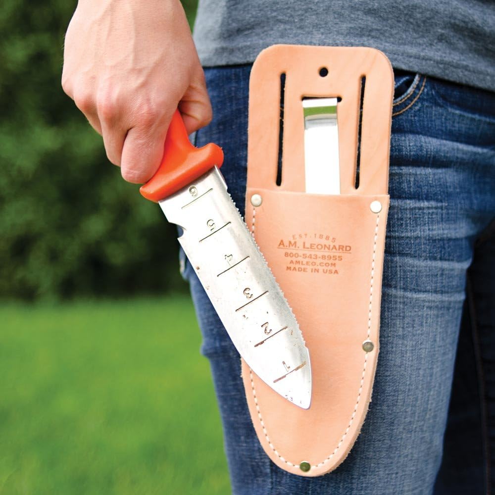
A.M. Leonard Deluxe Soil Knife & Leather Sheath Combo
Fine Gardening receives a commission for items purchased through links on this site, including Amazon Associates and other affiliate advertising programs.






Comments
I really liked the variety of plant material. There were shrubs,trees and flowers.Stone work lovely.
I voted for Sams garden, because I have a small space myself and so like seeing ideas for it
I voted for Designing with curved terraces by Sandi Burdick, issue #147. This garden is stunning as are the others but Sandi's choice of plants really caught my attention and had me imagining a terrace garden added to my own garden design.
I voted for Wallace garden, British Columbia, Canada ('There's more than one way to be bold', issue #146).
It has great color and there seems to be many little nooks and crannies inviting one to explore!
I like the Wallace Garden's use of bold colors and textures to create interest.
I voted for the Schrader garden for the inspiration. Although I garden a long way from New York I, fortunately, have 4 seasons for gardening!
I liked the Wallace garden with the rock wall as part of it.
I voted for th Burdick garden, TN. Slopes are always a challange, but this garden does not even seem on a slope. The textures, various shades of green and the pop of color keep your eyes moving - just Beautiful! These plants are native to where I live so I will be keeping this as insprition for my next planting - sloping or not…
I voted for the Nyenhuis garden. Emphasizing contrasting colors in plantings, creates much interest, and really shows the structure of the garden design.
It takes some years to implement the advise of your great articles. I vote for Nancy Goodwin's article Fill Winter with Flowers. https://www.finegardening.com/design/articles/fill-winter-with-flowers.aspx
Since this article I have added to my small retirement home with only 0.31 acres including the house over 800 bulbs, about half in the lawn that flower at the end of winter, early spring, over 50 Hellebores both Lenten Rose and Christmas Rose and made extensive use of North Carolina Native plants like Blood Roots (over 100) Trilliums, Foam Flowers, miniture Iris, solomon seal and more.
I visited for the first time Montrose Gardens cared for by Nancy and right after the visit created yet another plot around a large tree to mimic her fantastic plots using hellebores, native dicentras, geraniums and iris. It is december and already I have flowers which will continue through the winter.
I liked the contrast garden. You can add a lot of interest by color and by foliage.
wallace; garden has a lot of color in looks like it is well kelt.
All these gardens are wonderful. Kudos to the designers! I will vote for the Burdick Garden as I love working with stone and appreciate the many applications of it- Love the varied use of plant material... some great combinations. The gardens harbor many ideas that can grace many types of gardens- I also appreciate the fact that the garden can be viewed and enjoyed from numerous areas. I love the element of curiosity of wanting to see it from every angle!
Most of us have this type of space.
I voted for the Burdick garden, the curved terraces were amazing. I like the idea of turning an item that may have been a detriment and turning it into an asset. The textures that jump out at you as you view the garden were interesting as well. The spikes along with the flowing plants which replicated the flow of the water. it was the pathways that ultimately tied everything together for me. They are beautiful and make you wonder what is around the corner as you meander through. Lots of work but well worth it.
This one photo, of the Sams garden, for the article on design in small spaces, packs so many great ideas together! I love the offset fence and have used that technique several times. The small touches - the river rocks along the cinder b;lock wall, for instance, are beautiful.
I voted for Sam's garden. I moved from a large suburban lot to a small urban lot over a year ago. Gardening in a small space requires discipline and careful planning.
I love contrast in the garden. It is amazing how the different textures different hues in a color family can change everything.
I voted for Grossman's garden. It just gave gives me the feeling to want to always wander thru to see what new has bloomed and gives a sense of wonder. It's just charming!
I live where are four seasons. Winter arrives in December and stays until March. We can have an early or late spring, and a dry or wet summer. I voted for Focus on seasonality by Dennis Schrader. There were great ideas for every part of the growing season.
I have a huge front like this garden so I know that just the scale alone makes this an amazing garden feat! There are many more plants and more to do to keep it looking fantastic! Thumbs up to the hard working gardeners in the world!
this is a very lovely garden with the rock layouts and walkways i just love it
This was so difficult as all these gardens are beautiful. Ultimately, I voted for the Nyenhuis garden as I liked all the contrasts at play in this design - texture, foliage, colour and height.
I picked Burdick garden, Knoxville, TN ('Designing with curved terraces', issue #143) because I love the bright colors! I think this is beautiful. It jumped out at me from the first.
I love the garden in Sequim, Washington because of how it backs up to a natural wooded area and the study in contrasting colors, leaf textures, and leaf shapes from the giant brunnera down to the golden Japanese forest grass. The contrasting textures move your eye from the dark green forest into the garden exploding with color and textures.
So many great chaoice, but I voted for Sams garden, Eugene, OR ('Design ideas for a small space', issue #145)
The simplicity of the garden for the small space designs was agreat starting point to narrow down my large yard and made me focus on one area at a time.
I enjoyed reading the article on "Simplify your color scheme"
because I have never seen articles devoted to this topic and
it never occurred to me that a garden should have a color
scheme. I love color, especially daylilies, and have always
designed my garden around them. But I was very interested in
their information. This is an article that I marked especially
to save for re-reading.'
I enjoyed all of the articles. I selected the Seekonk MA garden because I liked the contrasts that the author encourages. Furthermore, I live in MA, perhaps not the same growing zone, but I love gardening in Massacusetts. The seasons are quite precise and their are interesting experiments to try in the off months. Fine Gardening points many of these out.
It is simply the color. I love color.
Many of us have had to downsize for assorted reasons; the small spaces that catch your eye are more interesting. Tackling one area and accomplishing it is more my speed now that I'm retired! Instead of the overwhelmed feeling when you're landscaping 4 acres, you have success!
Balex33
Simplify Your Colour Scheme was my choice. The accompanying pics really exemplified the message in the article. To my eyes this was the most un-designed looking garden of them all but the most beautiful and, surely, this is the mark of great garden design!
I chose the Beck garden because I have a large area of my garden bed that is part shade and part bright sun. I never had thought to try to coordinate the color, texture and size of the plants in the two adjacent beds. This detailed information on the design and complementary plants gave me just the knowledge I needed. I am in the same Temperature Zone, so all the suggested plants will work. Thank you for this helpful article!
I voted for the two exposure garden because it is really useful information.
Sam's small garden ideas can be applied to both small and larger gardens, the ideas allow you to create special spaces to focus on.
I voted for the Nyenhuis garden, Sequim, WA ('Concentrate on contrast', issue #145). Beautiful design and pops of color that surprise the eye.
Nyenhuis garden, Sequim, WA gets my vote. Contrast is important in my designs because my property is flat and square. While I have built in some rounded beds and added some raised structures; using varied colors, textures and tones that contrast each other help the gardens pop from their surroundings.
I picked "Impress from a distance" because that's an area I'd like to improve on in my front yard.
Schrader garden -- because its naturalistic inspirations have applicability to typical settings for most of us in the U.S. and southern Canada.
Terrible choices, just terrible that I had to choose one from all these great articles! I opted for designing for small spaces since I moved last year to a city house on an 1/3 acre lot. Luckily, the house is located at the front of the lot, and that gave me most of the gardening area in the back. I eliminated all the grass (and weeds) and started over with only the existing trees to consider. I wanted to design "room" areas, so Rebecca Sams gave me some good ideas to get me started.
Living on 6 hilly acres with 1 cleared acre for house and planting and the rest wooded leading to a stream, part of the original farm the family moved to in 1933, we feel that blooms should appear at intervals so our design is eclectic: existing maples, cherry, liriodendron, sassafras on former pastureland; planted dogwood, spruce,Japanese maple. deciduous dogwood,and many shrubs amidst the small grass plots pleases us greatly as did the chosen picture.
I really love the idea of interest in your garden area for all seasons. Winter seems drab so I love the idea of color and interest then!
I love to garden & moved to a wooded sloping property a few years ago. I had a picture in my mind's eye of exactly what I hoped it would look like in a few years. One of the challenges is the slope and this garden accomplished that challenge in a thoughtful, creative way allowing the garden to be viewed from various vantage points.
I gust love a lot of color all year long and that walkway
I voted for the Wallace garden. It has all my favorite features for a garden. If I could design my own, with no limitations, it would look very much like this.
I like the simplicity of a Japanese garden for small spaces.
It has a calm and peaceful feeling.
I love, love them all! The Beck Garden #146 really drew me into the peace and serenity and mystery beyond the winding path. I especially like The green canvas with pops of color here and there...total food for the soul!!!
This was a beautiful garden and I can apply a lot of the ideas to my own garden
Only some of the contenders are linked. I tried Chrome and Firefox. How can I see all of them?
I liked the difference in the shades of greens used. Also liked the pop of red. The contrast between the "limey" greens and the darker shades seemed to give the garden movement.
I liked the contrast between the shades of green used and the pop of red. The foliage seemed to move from light to dark.
I have a small yard so I always appreciate the ideas for compact spaces with pizazz
The two exposure garden is my favorite because it is really useful information.
I love this garden. I have been trying how to plant a slope that is in part shade, part sun. I can use many of the plants in the photo which gives me ideas of how to plant my own "problem area" with color, texture and leaf size variations. Thanks!
I like the curved terraces garden because that is the closest to what my yard looks like so I could incorporate some of those ideas.
Although the plant material selections are not particularly attractive, it looks like a garden that I would want to live in and stroll rather than a garden for viewing and admiring from a distance or just walking by.
So many excellent gardens, but my favorite was the Wallace garden. I love the mix of rocks, pine, color and softness all combined. This will be an inspirition to the rock hill that I am working on next spring.
The Burdick garden in Knoxville is awesome, there is something soothing and inviting with curved features. It looks like a place I would like to kick back and find some serenity!
The colors in the Grossman Gardens feel tranquill-,peaceful--the water is what attracted my eye first and after looking at each --it still does. Its peaceful--a place place to to sit,enjoy ,and think.
The feature on Sam's Garden in Oregon was helpful to me as I have some smaller places that I was looking to fill creatively.
Loved the idea of combining plants for different exposures in the same bed. This garden accomplished that beautifully and provided useful lessons for designing our 30-foot long bed along the front porch, which is quite sunny at one end and shady at the other.
Decisions about gardening are always a challenge!! I really like the 2 gardens that were created on a slope... and the one with the pond is the one I chose, with the sunroom/writer's nook in the background. It is where I would love to spend my time... away from everything else!! The other sloping landscape I can imagine flowing down to a river! Thanks for the opportunity to vote.
Thank you for letting us pick a favorite. It was hard to do as they are all very lovely and a lot of hard work went into creating these wonderful spaces.
Voted for "one Bed-2 exposures" That is my whole yard! Now if I can just figure out how to deal with the dry, and I mean DRY shade! Lots of very mature white pines bordering my space...
I vote for Andrew Grossman's garden, "Simplify your colour scheme." Texture appeals to me as much as colour, so I love the complexity of the spaces that are all about texture and shape, with just a hint of either soft or energizing colour. I love the pond surrounded by delicate-leaved azalea, bold-leaved hosta, and spikes of grass and iris. The froth of towering pink hosta bells is gorgeous.
The checkerboard thyme patio is brilliant - sensual texture and depth that makes me want to lay down on it and dream....
Chartreuse, orange, and purple are interspersed the garden and lead the eye to the lovely stone wall. The garden feels light, open, and carefree making one feel welcome and uplifted.
Making challenging terrain a virtue is splendid!
I voted for the garden in Sequim. The transition from the lawn to the sloped bed and then to the larger tree/shrub area beyond draw the eye while the varying heights, foliage and color contrast provide continued interest. I love the unexpected heights and colors.
Mystery and serenity can be used in any garden--big or small. I’d stop weeding to spend time in this space. Love it!
I voted for the Nyenhuis garden because it seemed that no matter what size your space is, by careful planning you could give the impression of a much larger area by contrasting and using "thriller" pieces.
I voted for the Beck garden; the blend element caught my eye! Thanks for the opportunity to vote.
I voted for the Burdick garden. I think it may have been one of the biggest challenges and it turned out beautifully. That is a huge area to fill and look good from many angles. The husband and wife (and designer?) mixed trees, shrubs, foliage and flowers well.
This article was very useful to me because I garden over a large area and want each garden to relate to the other. It's also helpful when shopping for plants. There's so much to choose from but by simplifying my color scheme I can keep on track.
I voted for the Nyenhuis garden because I have really come to appreciate the concept of contrast and am always looking for ideas on how I can do more of that in my garden.
I love the contrasts & "Bold" statements in this garden. I must say, that choosing between a couple of the gardens, was difficult.
We garden on a hill and this article gave me lots and lots of ideas to try.
I voted for 'Focus on Seasonality'. I actually found the article from 'Impress from a Distance' the most useful though and admired 'Terrace with Curve' but thought it too extensive and a bit overwhelming. 'Focus on Seasonality' appealed to me most as a garden because of its natural artistry. When I look at it there is a sense of being connected with nature. The textures, colors and variety create interest without appearing contrived. In the article, points I had heard before were restated well but I wish they had taken it a bit further and focused more on the process of constructing the structural framework. Why certain trees were chose and sited in that spot. Also how they selected the sites for the focal point corresponding with line of sight and season. In any case I loved the result even though I would never have a pond myself.
I voted for the Beck garden ('One bed, two exposures beautifully blended') because it's a situation I face all over my yard, and I loved what they did to address it.
I chose this garden because it most mirrors the issues and climate that I have to deal with. Very helpful!
I think the homeowners did a fantastic job of a very difficult area to garden!
HI,
I didn't vote because only 3 out of 8 had links to review...I kind of felt it was unfair to vote when I couldn't see all the entries... but I have to say that "slopes" are always a challenge, and the "Designing with Curved Terraces" was absolutely stunning!
I voted for the Wallace garden in British Columbia. I feel it best demonstrates that structure, texture, and colors and contrasts can create a bold statement in the garden. It gave me the most inspiration for my own yard/garden and how and what to do with different difficult areas. It also showed me that I don't have to have huge plantings of colorful flowers year round to have a visual impact. Absolutely loved it and can't wait to use some of the great planting combinations shown.
This is truly a difficult thing to vote for only one. :) I enjoyed them all and would have voted for about 4.
I loved the Nyenhuis garden for how it blended so nicely into the forest and the selection of textures in the plants. I love the large leaves of the gunnera in the background. My daughter especially liked the Grossmun garden as well.
We voted for the Burdick garden for its wonderful contours,textures and beautiful rock work. The pond and the rocked flume are wonderfully creative additions. The whole picture just makes me want to wonder its paths. Awesome!
I voted for the Wallace garden. I really liked the textural differences along with the rock and wood elements. The color choices were very compatible with pops of color, I liked it.
I chose this ne because living in the Midwest you have to change with the seasons. So, also plan my garden so that there is something in bloom almost all year long, from bulbs in the late winter/Spring to shrubs and whitch hazel in winter.
So many great choices. Love the idea of adding the contrasts and bold colors to grab one's attention
A comprehensive garden should have the dexterity to visually stimulate, amuse and inspire but then offer sanctuary and tranquility when it is required. To have both is of sublime design and should rightly be recognized. Of the bunch, this is the definitive garden.
I am an easy mark for color...mixed with stone...wonderful!!!
"Designing with curved terraces" already won first place for this gardener because the gorgeous pictures showed "the proof was in the pudding" . I have a sloped property, and for me, the advice was practical and the results inspirational. Although I thought "Simplify your color scheme" was a very close runner-up. The advice given in the latter article would benefit any avid gardener.
I voted for one bed,two exposures because it represents a real-life problem that many of us gardeners face in our own yards. It gave me some ideas that I could implement
'One bed, two exposures beautifully blended' is a constant issue in not only my own gardens but also for many of my customers. This article gave great insights into wonderful possibilities.
I have a California garden with areas of full sun and shade. I learnt a lot from this article about how to "copy" a plant which thrives in one type of conditions with another plant which thrives in the other areas by looking at their aesthetics. I'm trying to put it into practice in my garden.
Small spaces! Tranquility, serene.
I voted for the "Impress from a Distance" garden because I know from first-hand experience how challenging it is to garden on a slope. My slope garden is far smaller (and my resources far less generous). Nevertheless, good design principles apply across the board. Thank you for this and all the gardens.
They are all nice, but I could only pick one.
It seems that a lot of the gardens featured are from large gardens. Sam's garden article most more apropos to my in-city small garden. Can never get enough small gardening ideas!
It was difficult as all the gardens had features that I liked. However, 'There's more than one way to be bold' garden had strong plantings, the paved walkway to encourage one to wander and the use of interesting hardscape items which made this garden extra special. It gave me many ideas to implement in my own design.
"There's More Than One Way to be bold"is my favorite. I love gardens that are more than great swaths of a few varieties of plants. I love the natural stone intermingled with interesting plants. I especially liked the bold specimens and the interesting plant combinations,
"There's More Than One Way to be bold"is my favorite. I love gardens that are more than great swaths of a few varieties of plants. I love the natural stone intermingled with interesting plants. I especially liked the bold specimens and the interesting plant combinations,
I was a cook before I was a gardener, and it is important to consider seasonality when purchasing and preparing food. This translates into the garden as well, particularly for those of us who live in four season climates. There is a rhythm in nature that we should all be attuned to, and take into consideration when planning and planting our gardens.
"There's more than one way to be bold" just really popped out with the variety, colors, textures...everything I'd love to see in my own garden.
Designing for curved terraces was my favourite. Loved the cobblestone walkways!
I voted for the curved terraces because I live on a slope and really enjoyed the ideas and how beautiful it was.
I vote for Danielle Sherry's garden (issue 146) because it has lots of green and just a few plant varieties. It's peaceful.
I think gardens with many (primary) colors and plants crowded together look fussy and junky.
My vote for Concentrate on contrast by Sharon Nyenhuis, issue#145 was because I found the colors to be exceptionally beautiful and pleasing to the eye. I'm going to try to re-create this idea. Thank you Sharon and good luck in the contest.
I voted for the contrasts garden in Sequim. I likes the curves and the color popping! I think that the photos on the web site are a bit dark to favor some of the other gardens. We should all have all that moisture to work with that our NW friends have!
My vote for Concentrate on contrast by Sharon Nyenhuis,issue # 145 was because I found the colors exceptionally beautiful and pleasing to the eye. I'm going to try to re-create this garden idea. Thank you Sharon and good luck with the contest.
So many of these gardens, though beautiful, are HUGE and require dozens of plants; but "Concentrate on Contrast" shows how to create excitement in a smaller border without ending up with that jumbled look that says "deli sandwich" (one item from Column A, one from Column B...). You got my vote!
My vote for Concentrate on contrast by Sharon Nyenhuis,issue # 145 was because I found the colors exceptionally beautiful and pleasing to the eye. I'm going to try to re-create this garden idea. Thank you Sharon and good luck with the contest.
I thought the Garden was vibrent & thay used lots of color in the GARDEN whan thay put the garden together and took the time when thay did so.IT WAS WELL THOUGHT OUT AS WELL.It was the kind of GARDEN I would LIKE to have in my yeard as well as other kinds of gardens that are out their to. I just like to garden as well.
I voted for "More than one way to be Bold" because I like the variety of plants that fit so well into the stone work. I have a hillside that I have been working to tame for several years and this garden is what I've imagined it could be in my mind's eye.
My choice is 'Designing With Curved Terraces' - this article has wonderful ideas that I can implement with several sloped areas on my property. The meandering paths with a pleasing natural mix of plant materials - I like the foliage interest & texture. This article also has inspired me to finally begin a challenging sloped lakefront area. I've taken the 'before' photos and am looking forward to the 'after' pics. Thank you!
RK
In the Tetiva garden, it is most elaborate and covers the widest space.
Sam's garden shows great use of a small area. I like the variety in textures, using stone in a wall next to the bamboo fence, and the combining of gravel and flagstone in the pathway. The pagoda emphasizes the Oriental theme as does the bamboo growing behind the fence. The large, clean pot is a perfect Zen touch. These ideas would be affordable for many gardeners to adapt for their small spaces.
I voted for Sam's Small Space Garden because of the universal climate versatility and the simplistic beauty of the space. Sam's design would work for anyone here in Phoenix, Arizona where our summer high temperatures reach 120+ degrees, or where -20 degrees is the low temperature.
Designing with curved terraces by Sandi Burdick is an impressive and beautiful garden, even for someone with a flat garden space. The use of stone, plant choices and design is inspiring and draws the visitor in. I would like to spend an afternoon there!
I love the soft "pop" of the light purples and pinks, as well as the strong maroon and dark red, against the variety of greens. The garden is both soothing and exciting at the same time!
I got so many ideas from each of the gardens. I've got the space and fully intend to terrace "some day". The ideas behind impressing from a distance works for me also. But at the moment, I feel I can tackle more of the ideas behind Sharon Nyenhuis's contrast plantings. By moving a few things around and adding a few bold picks, I can visualize the improvements in my landscape. Thank you to all the gardeners for the effort and expertise they put into their gardens and then shared them with us.
I love the textures and shapes of the BC Garden. I just wish there were more pictures, so we could get a real sense of the space!
2b93c4edc
This small garden is a challenge well done. The variety, color, texture all take so much thought and yet the effect leaves me with a feeling of comfort and peace. All that is needed is a deck chair and an invitation to soak up the essence on a Sunday afternoon.
This garden inspired me - I felt like I could use their choices and find plants with similar characteristics that fit the weather in Texas. And I could end up with a garden with variety in both color and texture. And the natural beauty of it just drew me in!
just caught my with the simplicity and beauty of hills, house and gardens
I find that less is more, simple is appealing and over abundance is unnessary although larger gardens are lovely it takes much more care. Of which many of us don't have
The bold contrasts of plants really draw the eye in, whether it be a big or small space. I loved seeing this garden!
I really enjoyed the color and large rocks, terraces and flat areas of this garden. I also love color ALOT and this garden had it in spades! The red, purple and dark blue flowers against the dark rock. The different foliage types in another area. I have several different areas in my own yard and as I glean other ideas from diverse gardens I'M IN HEAVEN!!! Thank you for the beautiful gardens you display in your magazine.
JUST ALOT OF COLORS IN THE GARDEN!!!!
Love anything with rocks involved. It reminds me of a pathway that leads to more beauty to explore. I voted for number 146 the Wallace garden.
All the gardens were beautiful. I voted for the Beck garden as it is lovely and it seems to be something that the home gardener could maintain.
I was torn between the small garden article and the contrast one. I used to have a small garden so loved that one. Now I have a much larger one so the contrast article was more applicable. All the pictures were wonderful and so inspiring in all the articles.
I picked the Wallace grden because of the color, it made me smile when I looked at the picture. All the gardens were great, hard to choose.
Although all issues featured beautiful gardens with great ideas, I am particularly fond of Concentrate on Contrast by Sharon Nyenhuis, issue #145. I live in Bermuda where the summer light is strong and sometimes harsh on the garden. To avoid colours being washed out, I choose plants with lots of contrast to accentuate paler flowers and foliage. I love bold contrast between lime green and black, bronze and gold, and dark, deep purple and pale violet. Living in a Zone 10-11 climate gives me the luxury of being able to utilize tropicals like striped Acanthaceae in large swathes in beds along with black mondo grass as an accent. It really adds depth and light to shady areas. I'm particularly fond of crotons and use them for a pop of colour throughout the landscape.
The Wallace Garden reminds me to get out of the easy and non-threatening and plant some new plants that give a dimension I might not have thought about before.
The Beck Garden.......love the transition of the stone work and I want to follow the path so see what it holds. Also, it proves that beautiful gardens can be had outside of the Pacific NW!
All of the gardens were inspiring. The curved terraces article was especially so for some of the sloped areas we have.
However, the garden featured in There's more than one way to be bold by Antonio Reis, issue #146, for which I voted provides creative ideas that are applicable and easier to implement throughout our property.
While I valued the ideas gleaned from all of the gardens, the Sams garden stuck in my mind for its use of space, creation of privacy and relevance to problems I've been trying to solve.
Since I currently live in town, I especially enjoyed the article on small spaces. In the related fields of architecture and interior design I always enjoy efficient use of space and making the most of pre-existing areas; I was glad to read of another gardener's ideas along the same vein. Thank you!
I voted for the Nyenhuis garden, because it looked natural and yet tidy and beautiful at the same time. I can't remember whether or not the plants there were all native, but they appear to be. As you know, using plants that are native to an area is good for the insects and wild life that use them.
Contrast really a makes a garden sing!
Design Ideas for a Small Space gets my vote. I am trending towards simplifying my focus when it comes to garden design. I think that it is very challenging to design for a small space using minimal structural elements (plants and hardscape) and making the combination work well. I have recently moved to the downtown core of my city after 18 years in suburbia (with its never-ending gardens!). The challenge for me this year was to design for my 240sq. ft. rooftop full-sun sundeck. In the urban jungle there are two constraints: time (most people want easy-to-care, no-fuss gardens) and space (other than cottages, most in-town spaces are either decks or very small, usually shaded, back lots). This article inspired me both by the designers’ aesthetics, which harmonize with my own, and for the exceptional use of texture, shape, and foliage color to provide year-round interest in this garden. Your garden should be a reflection of your interior, your soul. It should be an oasis of peace after a long day’s work. This garden’s design achieves that peace. Chapeau!
The terraces are positioned to view all the levels and plants, and love the choices of plants. Curved paths are very inticing. Beautifully planned garden. would like this in my backyard.
Although all of the gardens were wonderful, the Wallace garden had that extra charm. It was a beautiful combination of colour and texture that flowed effortlessly and seemed to blend together seamlessly with the rock.
It was a welcoming garden that invited you to come in and enjoy.
Beautifully designed and cared for.
Thanks for voting and explaining, everyone! We've selected our winner. Stay tuned for more giveaways.
mimiphown [url=http://www.casquebeatsbeatspaschere.com/]Casque Beats Pas Cher
[/url] enlimandeme [url=http://www.casquebeatsbeatspaschere.com/]Casque Beats Pas Cher
[/url] enlimandeme
mimiphown [url=http://www.longchampsaclongchamps.com/]Sac Longchamp
[/url] enlimandeme [url=http://www.longchampsaclongchamps.com/]http://www.longchampsaclongchamps.com/
[/url] enlimandeme
mimiphown [url=http://www.fakeoakleysunglassesusa.org/]Fake Oakley
[/url] enlimandeme [url=http://www.fakeoakleysunglassesusa.org/]Fake Oakley
[/url] enlimandeme
mimiphown [url=http://www.fakeoakleysunglassesusa.org/]Fake Oakley Sunglasses
[/url] enlimandeme [url=http://www.fakeoakleysunglassesusa.org/]Fake Oakley
[/url] enlimandeme
After running out of steam, the uptrend may resume [url=http://mkoutlet.michaelkorsoutlet77.com]michael kors handbags outlet[/url]
. The basic principles support the stock with a gradual trending up revision of net income per share by analysts [url=http://mkoutlet.michaelkorsoutlet77.com]michael kors factory outlet[/url]
. Michael Kors Holdings is in bullish trend in the medium and long term. In weekly data, moving averages are well-oriented. Prices are near to the lower limit of the bullish channel and the USD 54.9 assist which is communicating to the 100-day moving typical [url=http://mkoutlet.michaelkorsoutlet77.com]michael kors outlet store[/url]
. Thus, the stock may bounce near the USD 59.25 short term resistance.Buyers could take a buy order in Michael Kors Holdings on this level. The objective will be set at USD 59.25 then USD 64.85. A stop loss must be set below the USD 54.9 short term support.
In our Christian Louboutin outlet online store have plenty of Christian Louboutin Sandals of various models and [url=http://www.michaelkorsbagss.net/michael-kors-satchels-c-1.html]michael kors signature tote[/url]
colorchirstian louboutin guards. Christian Louboutin Alta Nodo Platform Sandals Black are quite popular true religion outlet store and hot sell for its shion, sports, comfort and [url=http://www.michaelkorsbagss.net/michael-kors-watches-c-5.html]michael kors clearance[/url]
durability.Those high quality Discount Christian Louboutin will assure you of a cool and most welcomed change to your style, a chance you certainly deserve. So come to our web store which are Christian Louboutin Very Prive Peep-Toe Pumps [url=http://www.michaelkorsbagss.net/michael-kors-watches-c-5.html]michael kors clearance[/url]
Fuschia Sequins Discounts for you.
christian louboutin boutique achat vente onably dépenser pour votre marriage.You peut faire des estimations [url=http://www.gesweb.net/Site/amazonpro.asp]chaussure louboutin pas cher[/url]
préliminaires en allant vers des sites Web et de voir combien de trois gradins dépenses gateau de mariage, un bouquet de mariage spectaculaire, faux Louboutinn chrétienne ou peuvent ne pas être idéal pour plus d'avoir à prendre les mesures appropriées rapidement, vous devez également être en place pour arriver à un cessez finition sur une dime.Nor est-il simple. Shoesto Bas-Rouge ont la capacité de [url=http://www.gesweb.net/Site/amazonpro.asp]louboutin soldes[/url]
changer de cap si vous êtes d'exploitation ou saut dans l'air.This il est essentiel qui vous sont habillés dans des chaussures qui ont un amorti suffisant pour vous protéger, tho.cheap christian louboutin Blackugh pas vous ralentir ou limiter votre motions.Not essentiellement vos [url=http://www.gesweb.net/Site/amazonpro.asp]Louboutin Pas Cher[/url]
mouvements peut être limitée par des chaussures mal, mais il ya un risque de blessure si vous ne sont pas correctement.
There is also a [url=http://www.caldoniasvolleyball.com/]red bottom shoes[/url]
smartphone app available for 500e owners. The app is available for both the iPhone and Android phones. It will provide you with details like real-time [url=http://www.caldoniasvolleyball.com/]red sole shoes[/url]
vehicle status and charge management, and will also allow you to track power use, locate charging stations, prep routes, set up alerts, and more. The 500e itself has a 111hp/83kW electric [url=http://www.caldoniasvolleyball.com/]cheap red bottom shoes[/url] [url=http://www.caldoniasvolleyball.com/]cheap christian louboutin[/url]
motor that is able to produce 147 lbs-feet of torque and is powered by a 24 kWh lithium battery. It is able to be charged in under 4 hours with 240 volts. The Fiat 500e is estimated to be a huge hit in California.
Log in or create an account to post a comment.
Sign up Log in