Most people don’t want a garden that looks like a crayon box exploded, with every color under the sun scattered about and no rhyme or reason to the design. Yet without a plan to guide you, this can be the result after a few overly ambitious nursery trips.
The color wheel is a simple tool you can use to prevent Exploding Crayon Box Syndrome. Here are three basic color-theory concepts that will get you off to a good start using the color wheel to plan and refine your designs.
Rule 1: Complementary colors create eye-catching contrast


Complementary colors are directly opposite one another on the color wheel. These two-color combinations have high contrast and high tension, and they help add energy to a design. When chosen carefully, complementary colors provide the visual punch a garden needs to wake it up.
However, as with most things in life, it is possible to have too much of a good thing. Use a bit of restraint with complementary colors, or your garden will appear overly intense, with too much contrast. A good rule of thumb is to use plenty of analogous combinations between these punchier color pairings, allowing the eye to rest before moving on to the next vignette.
Rule 2: Analogous color schemes are easygoing and elegant


Analogous colors are those that are next to one another on the color wheel; they usually appear in groups of three to six hues. The center color is generally the dominant color, and the surrounding colors enrich the combination.
Analogous combinations tend to be the most harmonious, since the colors all have components of each other within them. Be careful, though. Using too many of the same analogous combinations can result in a somewhat predictable design.
Rule 3: Split-complementary schemes are charismatic yet controlled


If you’d like to create a design with the perfect blend of soothing and high-energy moments, the split-complementary color scheme will be your best friend. Simply put, these combinations consist of three analogous colors plus one complementary color. The analogous colors provide the “aaaahhh” moment, while the complementary color keeps things lively.
The first step is to choose your three analogous colors. Next, draw an imaginary line from each color to the center of the color wheel. At this intersection, continue drawing a straight line that ends at the opposite side of the color wheel. Voila! You’ve found the complementary color of the three analogous colors. The resulting combination will offer the perfect blend of soothing harmony with just a hint of dynamic contrast.
Fixing a Design Mistake: Use Color as the Peacemaker
Nobody’s perfect, and sometimes our best efforts at creating eye-popping combinations can go awry. Luckily, with color wheel basics, you now have a tool at hand that can help you pinpoint the offending culprit.


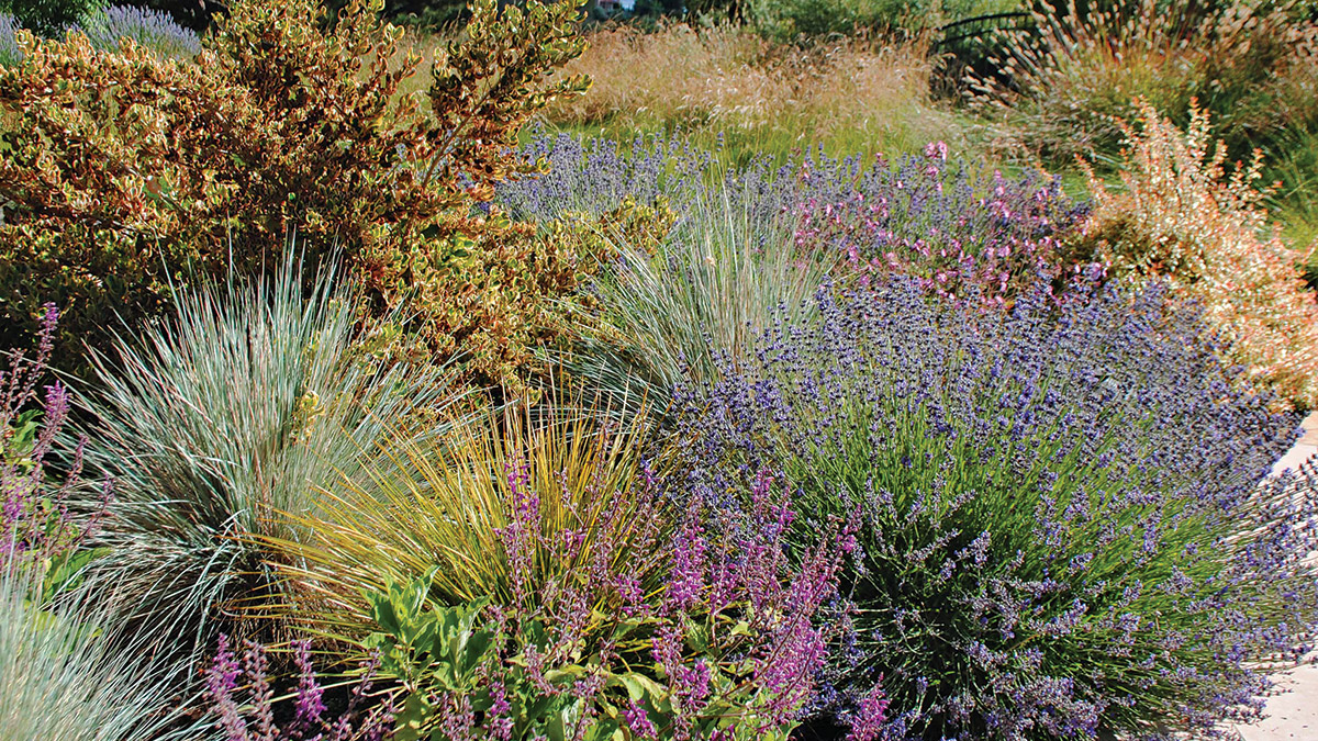
For example, in the first photo, notice the lack of harmony between the yellow-orange colors of the ‘Pink Splendor’ mirror plant (Coprosma repens ‘Pink Splendor’, Zones 8–11) and the blue-green of the blue oat grass (Helictotrichon sempervirens, Zones 4–8).
Now look at the color wheel. Notice the placement of the colors of the mirror plant and the blue oat grass. The mirror plant’s colors (peachy orange, yellow-orange, and olive green) are set slightly apart from the steely blue color of the oat grass. These four colors aren’t analogous, complementary, or even split-complementary.


One solution to restore harmony to this combination would be to use the split-complementary color scheme and introduce hefty amounts of purple. In the second photo, the purple colors of the lavender (Lavandula cv., Zones 5–8) and salvia (Salvia cv., Zones 5–11) offer a counterpoint to the yellow-orange colors of the mirror plant.
Rebecca Sweet is the owner and designer at Harmony in the Garden, located in Northern California.
Fine Gardening Recommended Products

Planting in a Post-Wild World: Designing Plant Communities for Resilient Landscapes
Fine Gardening receives a commission for items purchased through links on this site, including Amazon Associates and other affiliate advertising programs.

Gardena 3103 Combisystem 12-Inch To 20-Inch Adjustable Metal Fan Rake Head
Fine Gardening receives a commission for items purchased through links on this site, including Amazon Associates and other affiliate advertising programs.


Comments
Log in or create an account to post a comment.
Sign up Log in